From the conversion glossary
Concepts referenced in this article, defined.
Concepts referenced in this article, defined.
Run rigorous A/B tests and personalize every visit on Shopify or any storefront — no engineers required.
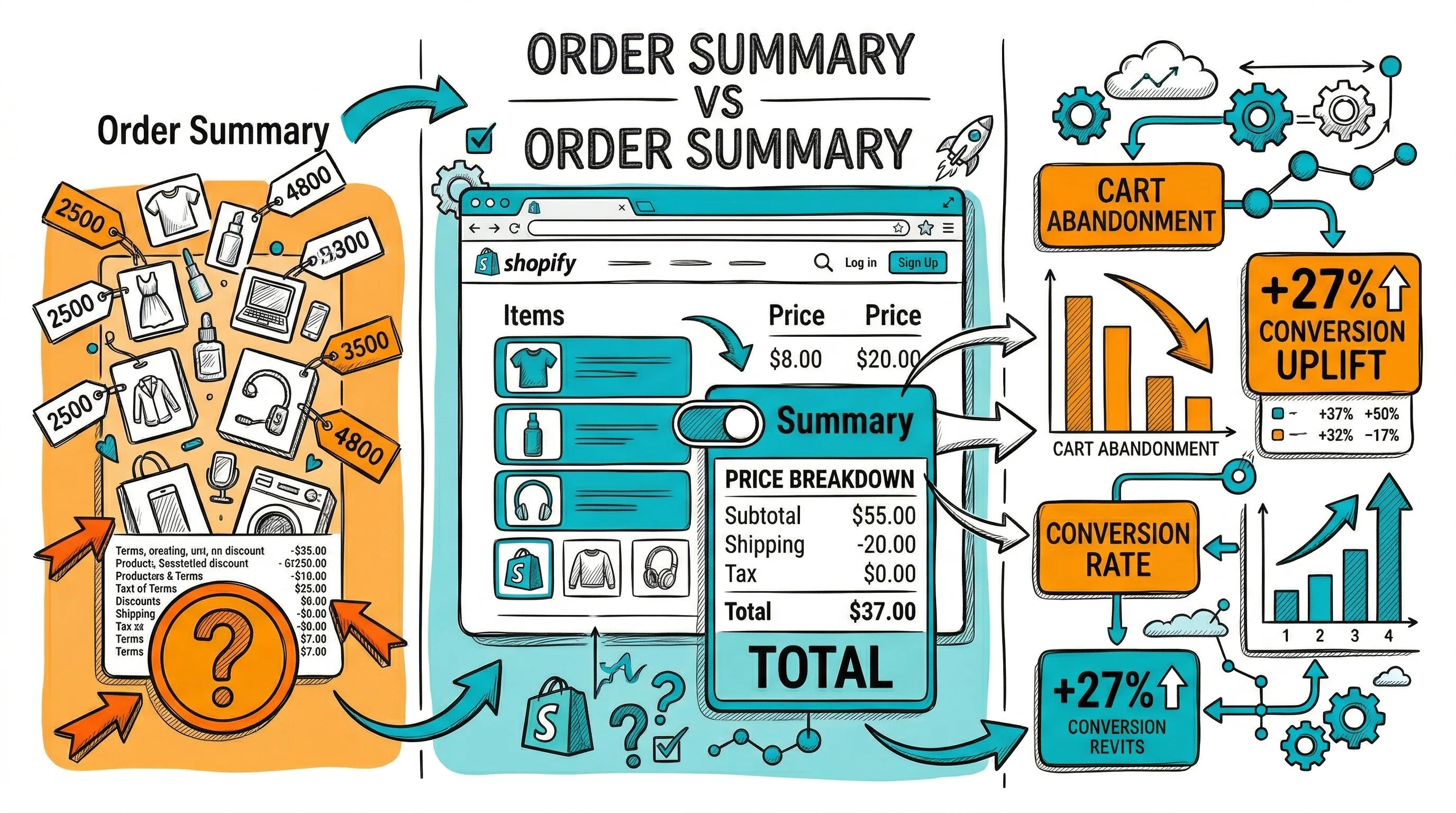
The order summary is the financial heart of your checkout—the place where shoppers verify exactly what they are buying, for how much, and when it will arrive. A clear, trustworthy order summary reduces checkout abandonment from price uncertainty and builds the confidence that completes purchases. A confusing or incomplete order summary triggers the most common checkout anxiety: "Wait, how much is this actually going to cost?"
The order summary serves two functions simultaneously:
Verification: The shopper confirms they have the right products, variants, and quantities before paying. This is the last check before commitment.
Trust reinforcement: Transparent pricing, visible discounts, and clear delivery information create confidence that the transaction is fair and the brand is trustworthy.
Both functions matter. A summary that shows incorrect product details (wrong variant) triggers corrections that extend checkout time. A summary that surprises shoppers with unexpected costs at the final step is one of the most common reasons for last-minute abandonment.
Product image: A thumbnail of each product in the order. The image serves as visual confirmation ("yes, this is what I picked"). Without it, shoppers rely on product names alone, which can be ambiguous for brands with similar product names.
Size: 60–80px thumbnail is sufficient. Must show the correct variant image (the color/flavor the shopper selected, not the hero product image if different).
Product name: Full product name as shown on the product page. Avoid abbreviations that might be confusing.
Variant details: Size, color, flavor, scent—whatever variants were selected. "Salwar Kurta Set, Blue, M" not just "Salwar Kurta Set."
Quantity: With easy edit functionality. Allow quantity changes from the order summary without going back to the cart.
Line item price: Price for each product × quantity.
Original price with strikethrough (if discounted): Shows the undiscounted price with a strikethrough (₹2,499) next to the actual price (₹1,999). The visual reinforcement of the saving is an important purchase motivation signal.
Discount summary: "You save ₹500 (20%)" in green text. Research consistently shows that making savings explicit increases checkout completion.
Subtotal: Sum of all line items before shipping.
Shipping: Either the shipping cost or "Free Shipping" (with the free shipping threshold or "because your order qualifies" if threshold-based). Never leave the shipping line as "Calculated at next step"—this creates uncertainty that drives abandonment.
Taxes: For Indian B2C brands showing GST-inclusive pricing, a simple "GST included" note suffices. For B2B or tax-exclusive pricing, show the GST amount explicitly.
Order Total: Bold, clearly the final amount payable. No ambiguity about what will be charged.
Estimated delivery date: "Estimated delivery: Monday, 20 Jan" (not "4–6 business days"). Specific dates outperform ranges. Shoppers making a purchase decision based on timing (gift for an event, running low on a product) need specificity.
Delivery method: "Standard Delivery via Delhivery" or "Express Delivery — 2 days."
Delivery address confirmation: In the final order summary, show the delivery address the shopper has entered (abbreviated). This is the last chance to catch address errors before payment.
Standard desktop checkout layout: form fields on the left (60–65% width), order summary sticky on the right (35–40% width). The summary stays visible while the shopper fills in contact, address, and payment fields.
Key design decisions:
On mobile, a persistent right column does not work—it would push form fields below the fold. Standard mobile pattern:
Collapsed state (default): At the top of the checkout page, show a collapsible summary bar: product thumbnail(s), item count, and total. A chevron or "Show order summary" label indicates it expands.
Expanded state: Tapping the summary bar expands it to show full line-item details, pricing breakdown, and delivery information. Shoppers can collapse it again to return to the form.
This pattern keeps the mobile checkout clean (form fields visible) while making the order details accessible on demand.
The order summary is also a trust reinforcement area. Include near the total:
These elements address the common final-step hesitation: "Is this safe? Can I return it if needed?"
"Calculated at next step" shipping: Shipping cost uncertainty is a top cart and checkout abandonment trigger. Calculate and show shipping in the summary as early as possible—ideally as soon as the shopper enters their PIN code.
No product image: Text-only order summaries feel impersonal and create variant confirmation anxiety. Always include thumbnails.
Ambiguous discount display: Showing only the final price without the original price removes the saving reinforcement. Show both.
Total that does not match expectations: If the total in the order summary is different from what was shown on the cart page (due to shipping or tax additions), explain the difference explicitly. Surprise charges at the payment step are checkout abandonment triggers.
Edit not accessible from summary: If a shopper notices a wrong variant in the order summary, they need a clear "Edit" option. Requiring them to navigate back to the cart via the browser back button is friction that causes abandonment.
With CustomFit.ai, test:
Related reading: Conversion Rate Optimization | Cart Abandonment | Checkout Flow | Payment Gateway | Checkout Progress Indicators
See also: Checkout & Pricing Pillar