From the conversion glossary
Concepts referenced in this article, defined.
Concepts referenced in this article, defined.
Run rigorous A/B tests and personalize every visit on Shopify or any storefront — no engineers required.
Heatmaps are the diagnostic tool that tells you where visitors engage with your pages before you run A/B tests to fix what's broken. A/B testing validates solutions; heatmaps identify the problems worth solving. Without heatmaps, you're hypothesizing blindly — testing changes based on design preferences or industry best practices without knowing whether those changes address what your specific visitors actually struggle with. A product page heatmap showing 80% of visitors don't scroll past the hero image tells you something completely different from one showing 80% scroll all the way to reviews.
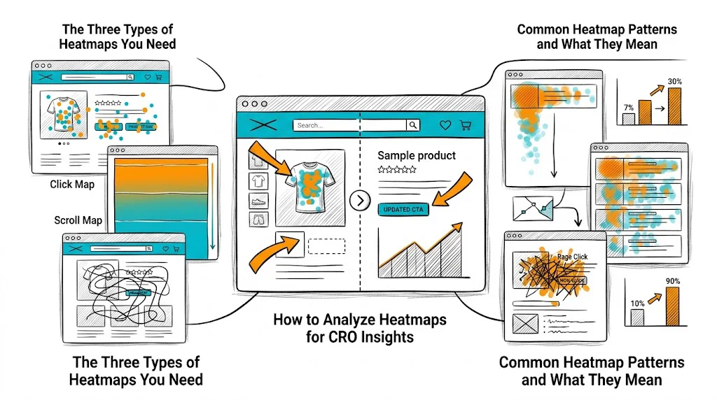
This guide covers how to use click maps, scroll maps, and session recordings to generate CRO hypotheses, prioritize your test backlog, and understand why your A/B test results behaved as they did.
Click maps aggregate where visitors click across hundreds or thousands of sessions, showing hot spots (frequent clicks) and cold zones (ignored areas).
What click maps reveal:
Actionable insight example: Your product page click map shows visitors clicking heavily on the product name (non-clickable) and on product category tags (clickable, but going to a different page). This tells you visitors are trying to navigate within the product but finding the primary CTA ("Add to Cart") less compelling than navigation elements. This generates a hypothesis: "If we make the product benefits more compelling above the fold, visitors will engage with the CTA rather than navigating away."
Scroll maps show what percentage of visitors reach each section of your page, from top (100%) to bottom (increasingly lower percentage).
What scroll maps reveal:
Actionable insight example: Your product page scroll map shows 85% of visitors see the product hero, 60% scroll to the description, only 25% reach the reviews section. Your hypothesis: "If we surface a review snippet above the fold (above the fold where 85% of visitors are), review-driven social proof will influence a much larger portion of visitors." This is a testable, heatmap-grounded hypothesis.
Session recordings are video replays of individual visitor sessions — watching exactly how a specific user moved their mouse, scrolled, clicked, and navigated.
What session recordings reveal:
How to use them: Don't watch sessions randomly. Filter for:
Step 1: Document your observations without interpretations Watch 30–50 session recordings and take notes: "User clicked product gallery 4 times but didn't click Add to Cart," "User scrolled back to product name after reading description," "User tapped payment section 3 times without proceeding."
Step 2: Look for patterns across sessions Individual sessions are noisy. Patterns across 20+ sessions are meaningful. If 15 of 30 sessions show users tapping the product image without seeing a zoom feature, that's a pattern.
Step 3: Form hypotheses from patterns "Multiple sessions show users tapping product images expecting a zoom feature. This might be preventing close inspection of product details necessary for purchase decision. Hypothesis: Adding pinch-to-zoom or click-to-expand on product images will increase add-to-cart rate."
Step 4: Prioritize hypotheses using PIE (Potential, Importance, Ease) Not every heatmap observation becomes a test. Score by potential impact, page importance, and implementation ease.
Step 5: Use heatmaps on your A/B test variants After a test, run heatmaps on both the control and the winning variant to understand how visitor behavior changed. This explains why the variant won and informs your next hypothesis.
High click density on non-linked text: Visitors are treating your headings or product attributes as navigation links. This means they're more interested in the sub-category or attribute than your main CTA. Consider making those elements clickable or replacing them with content that addresses what they're looking for.
Low scroll depth (most leave in top 30% of page): Your above-fold content isn't compelling visitors to continue. The hook isn't working. This is a strong signal to test above-fold copy, hero image type, or page loading speed.
Scroll depth cliff at the reviews section: If 70% of visitors see above the reviews section but only 25% reach the reviews, there's something at or just above the reviews section causing abandonment. Check if there's a "Add to Cart" CTA above the reviews — maybe visitors are converting before reaching reviews (good) or leaving there (bad). Cross-reference with conversion data.
Heavy engagement on trust elements: If click maps show high interaction with your trust badges (COD available, return policy, certifications), visitors are actively seeking reassurance before purchasing. This signals that expanding trust content would help conversion.
Mobile rage clicks on CTAs: If mobile session recordings show rage clicks on the "Add to Cart" button, either the button is not working on some devices, or it's positioned in a way that's difficult to tap (too small, overlapping with other elements). Fix immediately — this is a definitive conversion blocker.
High click density on product images, low on CTA: Visitors are very interested in the product (they're clicking to examine it) but not converting. This often means they're engaged but need one more piece of information to decide — commonly: price comparison, ingredient details, or social proof. Add the missing element between the product gallery and the CTA.
Indian ecommerce is 70%+ mobile, but most heatmap analyses are done on desktop data by default. Always run separate heatmaps for mobile and desktop.
Common mobile-specific discoveries:
Mobile session recordings are essential: Watch at least 20 mobile sessions separately from desktop sessions. Mobile behavior patterns are fundamentally different.
Microsoft Clarity (Free) Best starting point. Free with no visitor limit, integrates directly with Shopify. Provides click maps, scroll maps, session recordings, and rage click alerts. Excellent for brands without a CRO tool budget beyond their A/B testing platform.
Hotjar (Free tier limited) Free up to 35 sessions/day. More polished UI than Clarity. Includes feedback surveys alongside heatmaps. Good for brands running active CRO programs that need both quantitative (heatmaps) and qualitative (surveys) data.
Both tools work alongside CustomFit.ai — run heatmaps with Clarity or Hotjar to identify problems, then run A/B tests with CustomFit.ai to validate solutions.
Always run mobile and desktop heatmaps separately — the behaviors are different enough to require separate analysis.
Filter session recordings for high-intent non-converters — visitors who spent 5+ minutes and visited 3+ pages but didn't purchase are your most valuable CRO data source.
Use rage click alerts — both Clarity and Hotjar can alert you to pages with high rage click rates. These are urgent conversion blockers that need immediate investigation.
Collect heatmap data before you start A/B testing — hypotheses grounded in behavioral evidence produce tests with higher win rates.
Look at heatmaps on your A/B test variants — understanding how behavior changed between control and variant explains why the test result occurred and informs your next test.
Rerun heatmaps quarterly — visitor behavior evolves as your product line, traffic sources, and seasonal patterns change. A heatmap from 6 months ago may no longer be relevant.
Combine heatmaps with exit surveys — "Why are you leaving today?" exit survey data provides the "why" that heatmap patterns suggest but don't explain directly.
Related reading: Funnel Analysis Drop-Off | Above the Fold Optimization | CRO Roadmap: 90-Day Plan | Bounce Rate | CRO Pillar Guide