From the conversion glossary
Concepts referenced in this article, defined.
Concepts referenced in this article, defined.
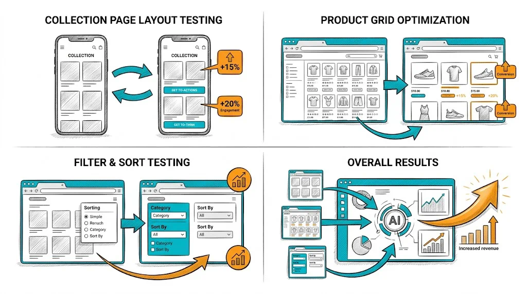
Run rigorous A/B tests and personalize every visit on Shopify or any storefront — no engineers required.
Accessibility in ecommerce is often discussed as a compliance obligation—something brands do to avoid legal risk. But the most useful frame for D2C brands is different: accessibility improvements benefit everyone. Higher contrast ratios make text easier to read in sunlight. Larger touch targets reduce misclicks on mobile. Clear form labels reduce checkout errors. These improvements lift conversion rates across your entire user base, not just for the ~15% of the global population with some form of disability. Accessibility is CRO.
The traditional framing of accessibility as purely a compliance matter misses the conversion opportunity.
The direct CVR connection:
Consider who benefits from common accessibility fixes:
The accessibility audience is larger than the disability audience. Every accessibility improvement has a multiplier effect across your full user base.
India-specific factors make accessibility particularly relevant:
Budget Android device prevalence: A significant portion of Indian ecommerce traffic comes from budget or mid-range Android devices with lower-quality screens, less color accuracy, and smaller display sizes. Accessibility practices—especially color contrast and text size—matter more when your customers may be on devices that don't render colors or sizes as intended.
Outdoor mobile usage: India has high outdoor mobile usage—commuters, street-level browsing, outdoor environments with bright sunlight. Color contrast WCAG requirements (4.5:1 for normal text) were partly designed to address readability challenges in varying light conditions.
Aging population growth: India's 50+ population with discretionary income and growing digital adoption represents a significant ecommerce growth opportunity. This demographic has higher rates of vision changes that make low-contrast and small text harder to read.
Hindi and regional language users: Accessibility for multilingual users includes ensuring that fonts support Devanagari and other scripts without rendering issues—a technical accessibility consideration specific to Indian markets.
Government requirements: While strict WCAG compliance isn't legally mandated for private Indian ecommerce companies in the same way as some western jurisdictions, the RPWD Act 2016 creates a policy framework that is likely to generate more specific requirements over time.
WCAG 2.1 Level AA is the international target for ecommerce. It organizes requirements into four principles (POUR):
Perceivable: Content can be perceived by all users, regardless of sense or technology.
Operable: Users can navigate and interact with the interface.
Understandable: Content and navigation are understandable.
Robust: Content works across different technologies (browsers, assistive technologies).
For ecommerce, the highest-priority WCAG requirements are:
1. Color Contrast
Test every text/background combination on your site using a contrast checker (WebAIM's contrast checker, or Chrome DevTools accessibility panel).
WCAG AA requirements:
Common failures:
The fix is straightforward: darken the text color or lighten the background (or vice versa) until the ratio passes. A contrast checker shows you the exact ratio in real time.
2. Alt Text for Product Images
Every product image should have descriptive alt text. This serves:
Good product image alt text: "Kapiva Amla Ashwagandha Juice 1L bottle with screw cap" (descriptive, includes product name, variant, and key physical detail)
Poor alt text: "Product image" or "SKU_12345" or missing entirely
On Shopify, alt text is added in the image upload interface. Set alt text for all product images as part of the upload workflow.
3. Form Labels and Error Handling
Checkout forms are accessibility critical. Every form field must have a visible, associated label (not just placeholder text that disappears on focus).
Common checkout accessibility failures:
On Shopify, checkout form accessibility is partially handled by Shopify's checkout engine. Third-party checkout modifications and custom forms on landing pages should be audited separately.
4. Touch Target Size
Minimum touch target size of 44×44px (Apple HIG) or 48×48dp (Google Material Design) for all interactive elements.
Common failures:
Larger touch targets reduce misclicks, improve mobile UX for all users, and are required for WCAG 2.5.5 compliance.
5. Focus Indicators
When users navigate by keyboard (Tab key), the currently focused element should be visibly highlighted. Many websites remove focus indicators for aesthetic reasons ("the blue outline is ugly").
This is a critical failure: users who navigate by keyboard lose all visual context of where they are on the page.
Fix: Ensure focus styles are visible (custom focus ring in brand colors is fine, as long as it's visible and has sufficient contrast).
6. Skip Links
A "Skip to main content" link at the very top of each page allows keyboard and screen reader users to bypass the navigation menu (which is the same on every page) and jump directly to the page content.
This is one line of HTML and one CSS rule—and it's a significant accessibility win.
Free, no-code tools:
WAVE (wave.webaim.org): Enter your URL and get a visual overlay showing accessibility errors, alerts, and structural information directly on your page. Excellent for seeing where issues are without reading code.
Google Lighthouse: Built into Chrome DevTools (F12 → Lighthouse tab). Run an accessibility audit for any page; get a score and specific issues with explanations.
WebAIM Contrast Checker (webaim.org/resources/contrastchecker): Enter foreground and background colors; see contrast ratio and pass/fail for WCAG thresholds.
Screen reader testing: VoiceOver (built into Mac/iOS) and TalkBack (built into Android) let you test what your site sounds like to screen reader users. Tab through your checkout process with a screen reader to experience common failures firsthand.
Several accessibility improvements directly benefit SEO:
Alt text: Already noted—Google indexes image alt text, which improves image search visibility and provides additional keyword relevance signals.
Semantic HTML: Proper heading hierarchy (H1, H2, H3 in correct order), ARIA landmarks, and structured HTML help both screen readers and search engine crawlers understand page structure.
Page speed: Many accessibility improvements (efficient alt text, proper HTML structure) also reduce page weight and improve load speed—a direct SEO and CVR benefit.
Descriptive link text: "Click here" is poor accessibility AND poor SEO. "Shop our Vitamin C serum collection" is better for screen readers AND for search engine understanding of link context.
CustomFit.ai's A/B testing and personalization capabilities should be implemented with accessibility in mind:
Links: Conversion Rate Optimization | User Experience | Bounce Rate | UX Design Conversions Pillar | Color Psychology Conversions | Search Filter UX Ecommerce