From the conversion glossary
Concepts referenced in this article, defined.
Concepts referenced in this article, defined.
Run rigorous A/B tests and personalize every visit on Shopify or any storefront — no engineers required.
A landing page exists for one purpose: to convert a visitor into a buyer. Every design choice, every word, every image either helps or hurts that conversion. Most ecommerce landing pages fail not because the product is wrong but because the page does not do its job of communicating value, building trust, and making the next step obvious. These best practices cover what actually moves conversion rate for Indian D2C and ecommerce brands.
A landing page is not a home page. The home page serves many types of visitors with many intentions. A landing page serves one specific visitor (coming from a specific source) with one specific intention (triggered by your ad, email, or campaign).
This specificity is both the challenge and the opportunity. When you know who is coming and why, you can create a page that speaks directly to that visitor's motivation and removes every obstacle to purchase.
The key principle: message match. The headline, image, and offer on your landing page must mirror the ad, email, or link that brought the visitor there. Visitors who land on a page that does not match what they clicked on leave immediately.
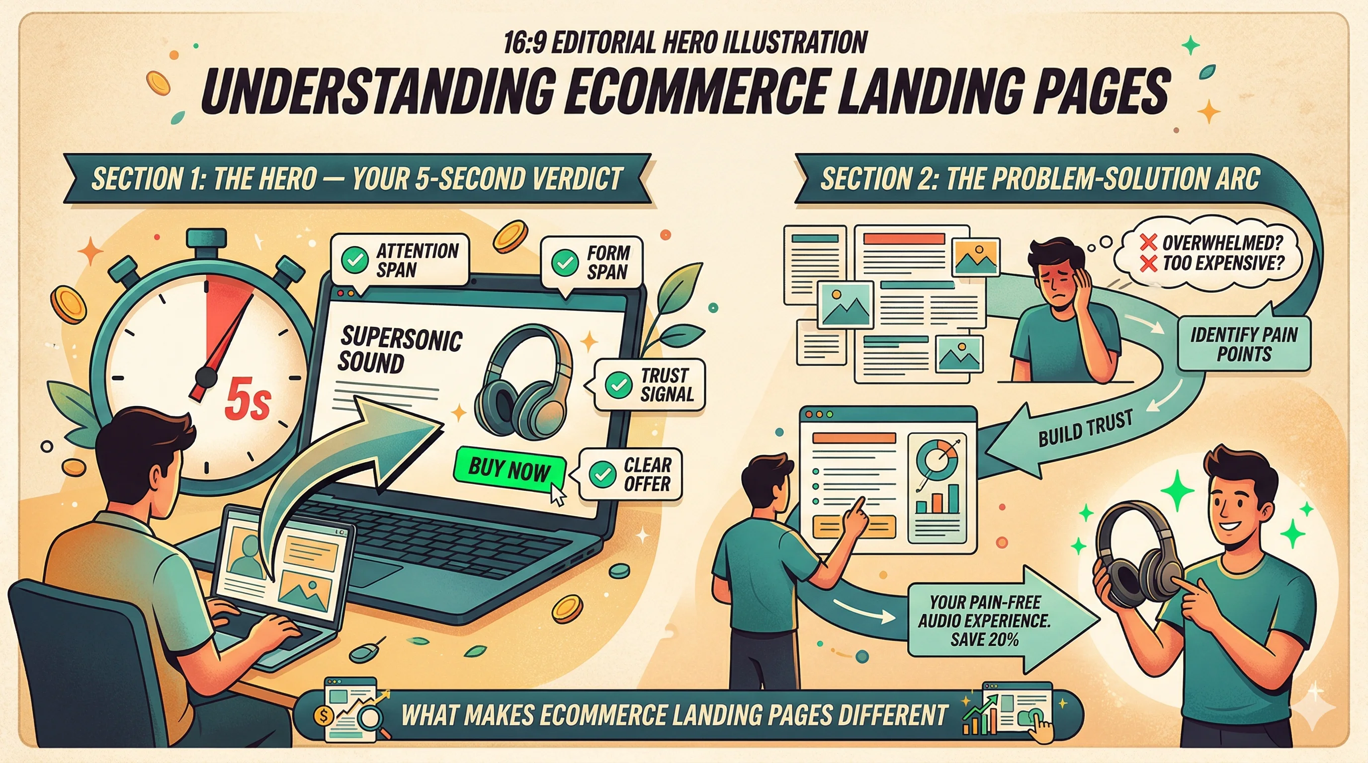
Visitors decide within 5 seconds whether to stay or leave. The hero section (everything above the fold) must earn their attention immediately.
Headline: One clear statement of your value proposition. Not your brand name. Not a tagline. The specific benefit the visitor will get.
Sub-headline: One sentence that adds specificity to the headline and handles the first objection.
Hero image or video: Shows the product in use, ideally in a context that mirrors the visitor's aspiration. For a skincare brand targeting working women, show a woman in a professional context with clear, confident skin — not a clinical lab image.
Primary CTA: One button, above the fold, with specific action-oriented copy.
Trust indicators above the fold: One or two trust signals (star rating + review count, "As seen in [publication]", certification logos) visible in the hero zone.
In India, 75–85% of D2C traffic is mobile. Your hero must work on a 375px wide screen with a 4G connection:
After the hero earns attention, the next section must connect your product to the visitor's specific problem.
Structure that works:
This arc works because it demonstrates that you understand the customer's experience before asking them to trust your solution. Customers who feel understood buy faster.
For most D2C products, the third section should give customers everything they need to understand what they are buying:
For skincare/personal care:
For supplements:
For fashion:
For electronics:
Social proof is the most persuasive section for most D2C products because it provides third-party validation that your claims are real.
Video testimonials: Real customers describing their experience in their own words. 60–90 seconds. Highest trust, hardest to fabricate.
Photo reviews with context: "Before/after" photos or "in use" photos with the reviewer's relevant details (skin type, age, how long they have used the product).
Star rating aggregate: "4.8★ from 3,200+ customers" — prominent, credible, specific.
Selected review quotes: 3–5 carefully chosen reviews that handle specific objections. "I was skeptical because nothing has worked for my combination skin before — this changed my mind."
Press and media logos: "As seen in" — The Hindu, YourStory, GoodHousekeeping India.
Certifications: Dermatologist tested, cruelty-free, FSSAI approved — category-specific trust signals.
For Indian audiences specifically: Reviews in Hindi or regional languages for Tier 2/3 targeting perform better than English-only reviews. Including reviewer city ("Sunita R., Indore") adds authenticity.
Every potential customer has objections — reasons not to buy. Your landing page must handle them before the customer uses them to justify leaving.
Common ecommerce objections and how to handle them on-page:
| Objection | On-Page Solution |
|---|---|
| "What if it doesn't work?" | Money-back guarantee with specific terms |
| "Is this safe?" | Dermatologist tested badge, ingredient safety info |
| "Will it work for my skin type?" | Skin type filter on reviews, specific "Best for" label |
| "I don't know my size" | Size guide with model measurements, size recommender |
| "Shipping takes too long" | Specific delivery promise ("Delivered by [date]") |
| "I've been burned by brands before" | Authentic reviews, brand story, founder visibility |
Anticipating and resolving objections on the page is what separates high-converting landing pages from average ones.
Your primary CTA appears in the hero. It should also appear after each major section so the path to purchase is never more than a scroll away.
CTA placement:
CTA copy that works for Indian D2C:
What to avoid: "Buy Now" alone. "Submit." "Click Here." These are process-oriented rather than benefit-oriented.
Landing pages should be tested continuously. Every element is a hypothesis. Use A/B testing to validate your assumptions:
High-priority tests:
Hero headline: Test two fundamentally different value propositions, not just word variations.
Hero image: Product on white background vs. lifestyle image vs. before/after vs. video.
CTA copy: Benefit-led vs. action-led. "Get Clearer Skin" vs. "Add to Cart."
Social proof placement: Above or below the product description?
Page length: Full long-form vs. condensed version.
CustomFit.ai's no-code editor lets you create and test variants of any landing page element on your Shopify store — serving different versions to different visitor segments and measuring conversion impact automatically.
How to read results: Measure conversion rate for simple tests. Use revenue per visitor (RPV) when testing changes that might affect both conversion rate and order value. A test that reduces CVR but increases AOV can be a net positive.
Every additional second of load time costs conversion. For Indian D2C brands serving Tier 2/3 audiences on 4G connections, page speed is more critical than for developed markets.
Target metrics:
Common speed killers on ecommerce landing pages:
Shopify's native themes are reasonably fast. Custom third-party apps are often the culprit for speed degradation. Audit your app stack if pages load slowly.
One page, one goal. Your landing page should have one primary CTA. Every navigation link and secondary CTA is a distraction that reduces conversion.
Lead with the customer's aspiration, not your product's features. "Wake up to clear skin every morning" beats "10% niacinamide + 1% alpha arbutin serum."
Match landing page language to ad language precisely. If your ad says "India's first caffeine face wash," your landing page headline should say something extremely similar. Any mismatch kills trust.
Test mobile before desktop. In India, mobile is primary. Build and test mobile first, then check desktop.
Use social proof specific to the campaign audience. If your ad targets women in Tier 2 cities, feature reviews from similar customers — not testimonials from influencers in Mumbai.
Review heatmaps and session recordings for every landing page variant. Heatmap data shows you where visitors engage and where they drop off — invaluable for understanding why a test won or lost.
A great landing page is not built in one session. It is iterated into existence through testing, data, and genuine attention to what your customer needs to feel confident buying from you.