From the conversion glossary
Concepts referenced in this article, defined.
Concepts referenced in this article, defined.
Run rigorous A/B tests and personalize every visit on Shopify or any storefront — no engineers required.
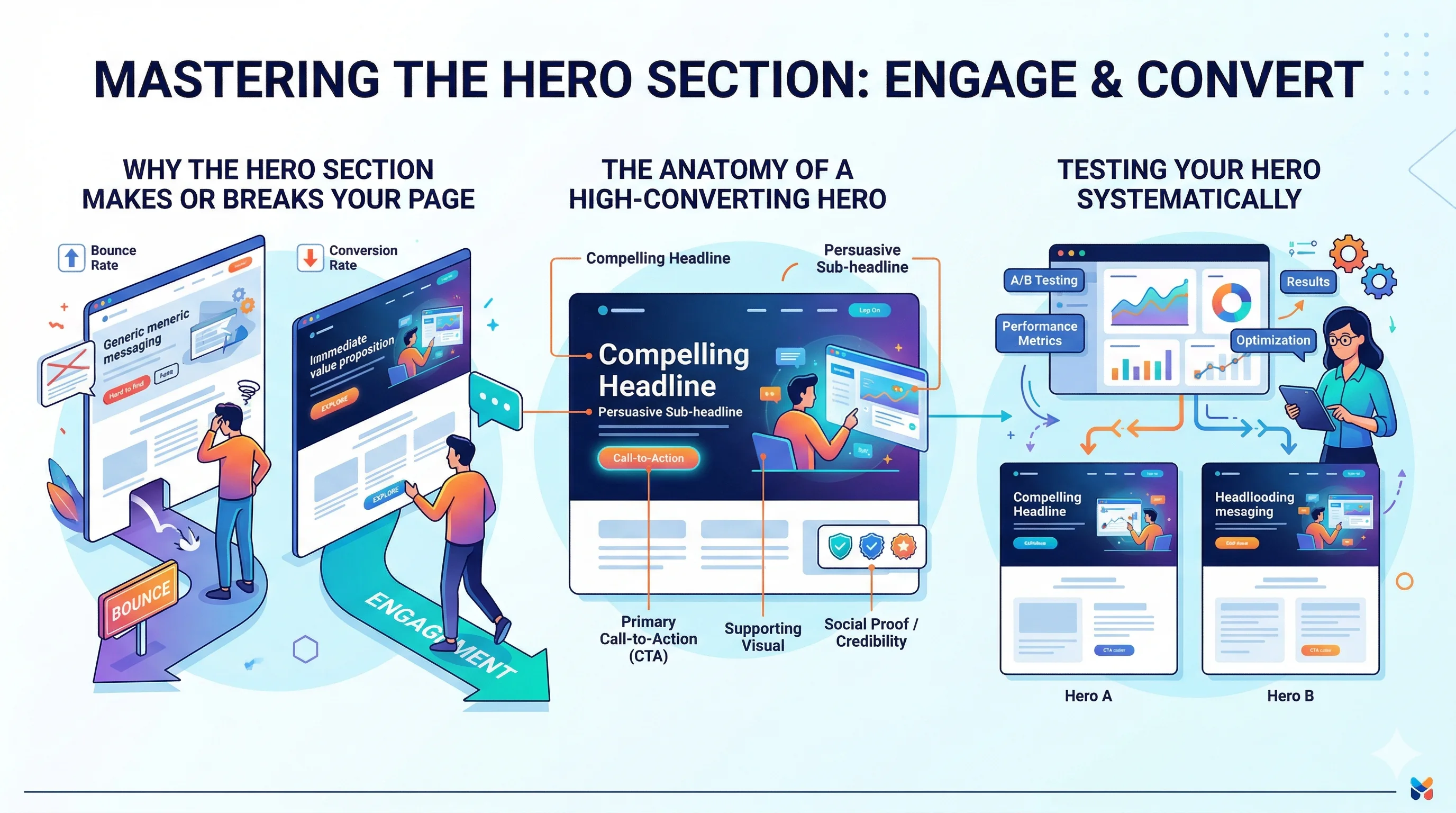
The hero section is the single most important piece of real estate on any landing page — it is the first thing every visitor sees, and it either earns the next scroll or loses the click forever. A high-converting hero answers three questions instantly: "What is this?", "Why should I care?", and "What do I do next?" Get those three answers right above the fold and the rest of the page becomes easier to convert.
Visitors form a first impression in under 100 milliseconds. By the time they consciously process your headline, they have already made an emotional judgment about whether the page is worth their time.
For Indian D2C brands running paid campaigns on Meta or Google, this matters even more. You are paying ₹15–₹80 per click. If your hero section does not immediately confirm that the visitor landed in the right place, that spend evaporates.
The three hero-section problems that kill conversions:
A brand like Bellavita fixed their hero message to match their Meta ad copy and saw an 11% lift in conversion rate. The fix cost zero in development — it was a copy and layout change alone.
Your headline is not your brand tagline. It is a direct answer to the visitor's problem or desire. The format that works most often: [Outcome] + [For Whom] + [Differentiator].
Examples that work:
What does not work:
Test your headline against the conversion rate optimization principle of specificity: the more specific the claim, the more believable and compelling it is.
The subheadline's job is to add the second most important piece of information — either proof, specificity, or a handle on objections. Keep it to two sentences maximum.
Good subheadline structure: [How you deliver the promise] + [Key objection handled]
Example: "Our 12-ingredient Ayurvedic formula ships within 24 hours and comes with a 30-day money-back guarantee — no questions asked."
This handles two objections (does it work? what if I don't like it?) before the visitor even reaches the CTA.
One CTA. Not two. Not three. One.
The most effective CTA copy on Indian D2C landing pages:
Button colour should contrast with your hero background. If your brand colour is orange and your hero background is white, a dark CTA button (navy, black) often outperforms the orange one because it stands out more. Test this — it is one of the highest-impact A/B tests you can run.
CTA placement: primary button in the hero, repeated after the first scroll. Do not hide it at the bottom.
Your visual should show the product being used, not just sitting on a white background. The goal is to help the visitor project themselves into the experience.
Winning visual formulas:
For mobile (which is 70%+ of D2C traffic in India), your visual should not crowd the CTA. Stack the visual below the headline and CTA on mobile, not beside them.
Message match means the language on your landing page directly mirrors the language in the ad that brought the visitor there.
If your Google ad headline says "Sugar-Free Protein Bar — Buy 2 Get 1 Free", your landing page hero must say exactly that. Do not make the visitor hunt for the offer they came for.
Brands running multiple ad campaigns should consider dynamic landing pages or at minimum separate landing page variants per campaign. Tools like CustomFit.ai let you personalise the hero section per traffic source without writing a single line of code — so a visitor from a festive season Meta ad sees a Diwali-specific hero while a visitor from a Google brand search sees a brand trust-focused hero.
Start with these five A/B test ideas for the hero section:
| Test | Variant A | Variant B |
|---|---|---|
| Headline specificity | "Premium Protein" | "25g Protein Per Scoop — ₹1,199" |
| CTA copy | "Buy Now" | "Try Free for 14 Days" |
| Visual type | Plain product shot | Lifestyle / in-use image |
| CTA colour | Brand orange | High-contrast black |
| Subheadline | No subheadline | Objection-handling subheadline |
Run each test with at least 500 visitors per variant before calling a winner. For smaller traffic volumes, prioritise the headline test — it moves the needle most.
Before you launch any landing page, run through this checklist:
Keep it above the fold. Every element — headline, subheadline, CTA, and visual — should be visible without scrolling on a 375px wide mobile screen. If you cannot fit all four, cut the subheadline before you cut the CTA.
Use numbers. "Join 12,000+ happy customers" or "₹499 flat shipping" anchors the visitor's expectations and builds credibility faster than adjectives.
Test one thing at a time. If you change the headline and the CTA button colour in the same test, you will not know what drove the result. Single-variable tests are slower but more actionable.
Do not let design override function. A beautifully designed hero that hides the CTA below a large hero image is a conversion killer. Prioritise function — the CTA must be easy to find and visually dominant.
Account for festive traffic spikes. During Diwali, Navratri, and Republic Day sales, update your hero section to reflect the offer. A visitor who clicks a "50% Off Diwali Sale" ad and lands on a hero that shows no mention of the sale will bounce within seconds.
For more on building high-converting landing pages, see the Landing Pages pillar guide and related articles on A/B testing landing pages and landing page personalization by traffic source.