From the conversion glossary
Concepts referenced in this article, defined.
Concepts referenced in this article, defined.
Run rigorous A/B tests and personalize every visit on Shopify or any storefront — no engineers required.
Fashion category pages are where the browse-to-product click rate is decided — but most brands treat them as static grids and focus all their CRO effort on product pages. The reality is that a visitor who doesn't click through from the category page never reaches the product page at all. These 10 A/B test ideas target the specific friction points of fashion category pages — image style, grid density, filter UX, size communication, and pricing display — based on what actually moves conversion for Indian fashion D2C brands.
Category pages serve two kinds of visitors:
Your tests should serve both. An explorer needs visual variety and a reason to keep scrolling; a searcher needs efficient filtering and clear product information. These 10 tests address both profiles.
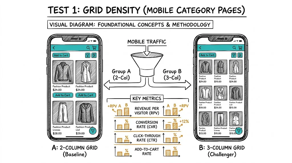
Hypothesis: A 2-column product grid on mobile (larger images, more visual detail) increases click-through rate to product pages compared to a 3-column grid (smaller thumbnails), because fashion purchase decisions are driven by visual appeal and a 2-column grid allows more impactful presentation.
Control: 3-column mobile grid Variant: 2-column mobile grid with larger product images
Expected lift: 12–25% increase in product page click-through rate Monitor: Also check whether the smaller product-count-per-scroll leads to higher scroll depth or causes visitors to give up earlier.
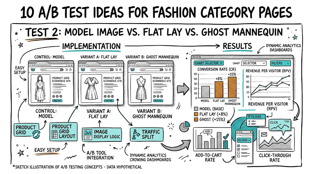
Hypothesis: Model images (showing how the garment looks on a real person) increase click-through rate from category pages more than flat lay or ghost mannequin images, because shoppers can better visualize how the item will look on them.
Control: Flat lay product images Variant: Model images with similar styling
Expected lift: 15–30% CTR improvement for women's apparel; 10–20% for men's casual Note: Test separately by category — the winner for women's ethnic wear may differ from women's western wear or men's t-shirts.
Hypothesis: Showing a prominent "40% OFF" badge on discounted items in the grid increases CTR to the product page, because visible discount signals create a stronger immediate motivation than price alone.
Control: Sale price shown without a badge Variant: "X% OFF" badge overlaid on the product image + sale price
Expected lift: 15–25% CTR improvement for items with meaningful discounts (30%+) Monitor: Don't rely on this test for items with small discounts — a "10% OFF" badge can actually signal low value in fashion.
Hypothesis: Showing available sizes (S, M, L, XL) directly on the category page image or below the product name reduces the click-and-bounce pattern where customers click through, see their size is unavailable, and return to the category page.
Control: No size information on category page Variant: Small size swatches (S/M/L/XL) with out-of-stock sizes grayed out, shown below each product card
Expected lift: Reduced bounce-back rate (from product page to category page) by 20–35%; potential 5–10% CVR improvement as higher-intent clicks make up a larger share of product page visits.
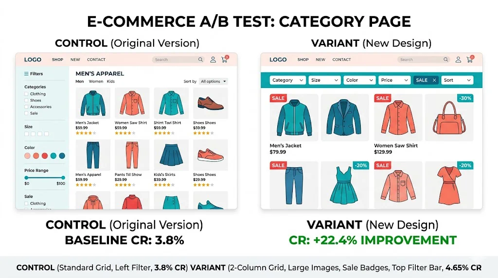
Hypothesis: A horizontal filter bar at the top of the page (collapsed by default on mobile, expanded on desktop) reduces the friction of filter discovery compared to a sidebar that requires scrolling to find on mobile.
Control: Left sidebar filters (standard for desktop-designed layouts) Variant: Top horizontal filter chips (collapsed by default on mobile)
Expected lift: 10–20% increase in filter usage, 8–15% improvement in add-to-cart rate from filtered sessions Mobile-specific: This test is primarily relevant for mobile where sidebars require horizontal scrolling or modal interaction.
Hypothesis: "Bestseller" badges drive higher CTR than "New Arrival" badges on category pages, because social validation (this is popular) reduces the perceived risk of clicking through to an unfamiliar product.
Control: "New Arrival" tag on recent additions Variant: "Bestseller" tag on high-velocity items, replacing or supplementing "New Arrival"
Expected lift: 10–18% CTR improvement for badged items; higher add-to-cart rate on product pages for badged products Note: Only badge genuinely high-selling items. False "Bestseller" labels damage trust when the product has few reviews.
Hypothesis: Sorting by "Popularity" (by units sold) as the default increases overall category page CVR compared to "New Arrivals" because most visitors are looking for validated choices rather than the latest additions.
Control: Default sort by "New Arrivals" Variant: Default sort by "Popularity" (units sold)
Expected lift: 8–15% improvement in add-to-cart rate from category pages Note: Run this test for at minimum 3 weeks, as the impact compounds over time as popular items get more views.
Hypothesis: Showing the same product on multiple body types (via image slider on the category card, or alternating images on hover/tap) increases CVR by reducing the "will this look good on me?" anxiety that's a major purchase hesitation in fashion.
Control: Single model image per product card Variant: Hover/tap reveals alternate model showing same product on different body type or skin tone
Expected lift: 10–20% CTR improvement for size-inclusive categories; 8–15% CVR improvement at checkout Note: This requires image asset investment — the test only applies where you have diverse model photography available.
Hypothesis: Showing original price crossed out alongside the sale price (₹1,999 ₹799) on category page cards increases CTR and add-to-cart rate for discounted items, because the visual anchor communicates value more powerfully than the sale price alone.
Control: Only current price shown Variant: Original price (strikethrough) + current price + "X% off" label
Expected lift: 12–22% CTR improvement for items with 30%+ discounts; 8–15% CVR improvement Important: Test separately during sale events vs. regular pricing periods — the effect size differs.
Hypothesis: Adding a "Complete the Look" horizontal scroll section at the top or bottom of a fashion category page (showing complementary items like accessories, footwear, or layering pieces) increases AOV by surfacing cross-category opportunities early in the browse journey.
Control: Standard single-category product grid Variant: "Complete the Look" horizontal section featuring 4–6 complementary items, placed after the first row of the main grid
Expected lift: AOV improvement of 20–35% for sessions that engage with the cross-sell section; flat or slight positive effect on primary category CVR
| Test | Element | Primary Metric | Expected Lift |
|---|---|---|---|
| 1 | Grid density (mobile) | CTR to product | 12–25% |
| 2 | Image style (model vs. flat lay) | CTR | 15–30% |
| 3 | Sale badge visibility | CTR | 15–25% |
| 4 | Size availability in grid | Bounce-back rate | -20–35% |
| 5 | Filter placement | Filter usage | 10–20% |
| 6 | Badge type (Bestseller vs. New) | CTR | 10–18% |
| 7 | Default sort order | Add-to-cart rate | 8–15% |
| 8 | Model diversity | CVR | 10–20% |
| 9 | Price anchoring | CTR + CVR | 12–22% |
| 10 | Complete the Look section | AOV | 20–35% |
See also: A/B Testing Pillar | Segmentation glossary | 10 A/B Test Ideas for Skincare Product Pages.