From the conversion glossary
Concepts referenced in this article, defined.
Concepts referenced in this article, defined.
Run rigorous A/B tests and personalize every visit on Shopify or any storefront — no engineers required.
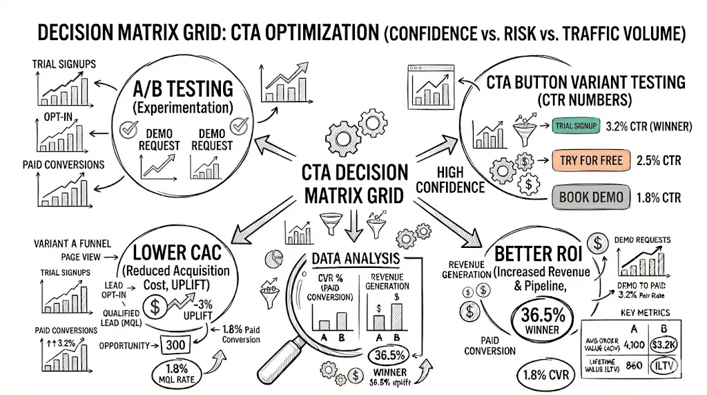
A/B testing call-to-action (CTA) buttons is the highest-ROI experiment most ecommerce brands haven't fully explored — because button color, copy, size, and placement each independently influence conversion rate by 5–30% in real store data. The most impactful single-element test is usually CTA button copy, followed by placement, then color. For Shopify D2C brands spending ₹50K+/mo on ads, a 10% CVR lift from a button test can mean ₹5L+ in additional revenue without increasing ad spend.
This guide covers what to test, what the data says, and how to structure CTA button experiments that produce statistically significant results.
CTA buttons are:
Before testing page layouts, navigation, or checkout flows, run at least 3–5 button experiments. You'll learn about your customers quickly and generate early wins.
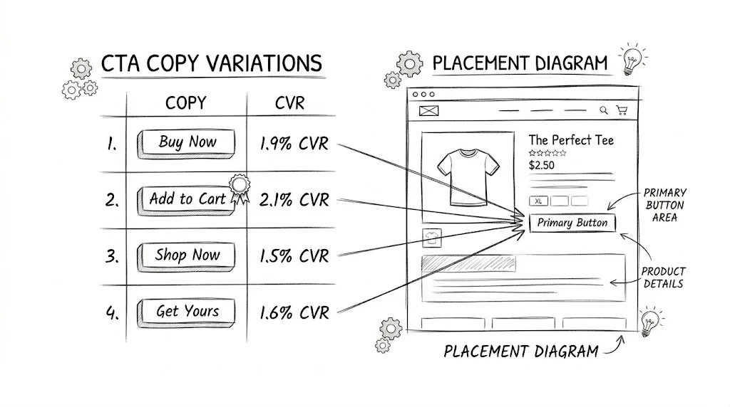
Copy is usually where the biggest lifts hide. Test these categories:
Action specificity:
Benefit-led copy:
Value reassurance:
Real example from Indian D2C: A skincare brand (similar to mCaffeine) tested "Add to Cart" against "Get the Glow — Add to Cart" on their Vitamin C serum page. The benefit-led variant lifted add-to-cart rate by 14%. Adding the benefit made the action feel purposeful rather than transactional.
What to test first: Run "Add to Cart" vs. "Buy Now" on your highest-traffic product page. These two perform differently depending on product price point — "Buy Now" tends to win for lower-price impulse products (₹299–₹599), while "Add to Cart" often wins for considered purchases (₹1,500+).
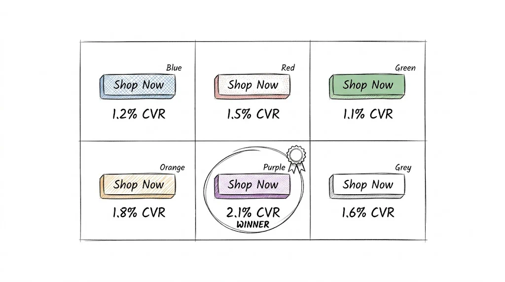
The "best" button color is the one that contrasts most with your page's visual hierarchy. Key principles:
Contrast wins over brand color: If your brand is blue and your page has blue elements, a blue button will get lost. High-contrast buttons (orange on white, green on grey) perform better in most tests because they draw the eye.
Color psychology matters less than contrast: The "red = urgency, green = go" frameworks are interesting but secondary. What matters is that the button is the most visually prominent actionable element on the page.
Common test structures:
Real data note: A beauty brand tested their standard teal "Add to Cart" button against an orange variant. The orange button lifted clicks by 11% — not because orange is universally better, but because it stood out against their predominantly white/teal page design.
What to avoid:
Placement is about reducing friction — putting the CTA where the visitor's attention is and making it easy to act without scrolling.
Above the fold: Test whether the primary CTA is visible without scrolling on mobile. On most Shopify product templates, mobile users have to scroll past the product image to see the add-to-cart button. Moving it up (floating button or sticky bar) consistently increases conversion rate.
Sticky/floating CTA: A sticky "Add to Cart" button that remains visible as users scroll the product description is one of the highest-impact tests for mobile. Brands like Plum and Pilgrim use floating cart CTAs on mobile — this is worth testing on your highest-traffic product pages.
Multiple CTA instances: Test adding a second CTA button at the bottom of the product description (after key benefits are listed). Users who read the full description are high-intent — giving them a second button to click without scrolling back up reduces drop-off.
Button size: On mobile, the button should be at minimum 44px tall (Apple's minimum tap target recommendation) and ideally 56–64px. Test a "large" variant against your current size, especially if mobile add-to-cart rate is significantly lower than desktop.
Beyond color, button styling affects click-through:
Shape: Rounded corners vs. sharp corners. Neither universally wins — it depends on your brand aesthetic. Test if you have a strong opinion on this.
Icon addition: Test a shopping cart icon alongside button text. Some brands see lifts from this, especially on mobile where the icon helps communicate the action visually.
Animation: Subtle pulse or hover animations on desktop can draw attention to the CTA. Test a version with a gentle pulse animation vs. static.
Shadow/elevation: A subtle drop shadow makes the button appear more "pressable," especially on flat design pages. This is a quick test with potentially meaningful impact.
Run your first CTA test on your #1 traffic product page. More traffic = faster significance = faster decisions.
"Changing the CTA from 'Add to Cart' to 'Buy Now — Free Delivery' will increase add-to-cart rate by at least 5% because it communicates urgency and addresses the most common objection (shipping cost)."
Use a sample size calculator. Input:
Most Shopify product pages need 1,000–3,000 visitors per variant for reliable results.
Using CustomFit.ai's visual editor: click the CTA button → edit text → save. Under 2 minutes.
Split traffic equally between control and variant. Use CustomFit.ai's audience targeting to ensure consistent traffic sources (exclude bot traffic and internal team visits).
Check results daily but don't stop the test early. "Peeking" at results and stopping when you see a lift introduces bias. Set a minimum run duration (2 weeks) and stick to it.
| Page Type | Test Idea | Expected Impact |
|---|---|---|
| Product page | "Add to Cart" vs. "Buy Now" | 5–15% ATC lift |
| Product page | Sticky mobile CTA vs. static | 8–20% mobile CVR lift |
| Collection page | "Quick Add" badge vs. none | 10–25% micro-conversion lift |
| Homepage | Primary CTA copy change | 5–12% click-through lift |
| Cart page | "Checkout" vs. "Complete My Order" | 3–8% checkout start lift |
| Checkout | "Place Order" vs. "Confirm & Pay" | 2–6% completion lift |
For Indian D2C brands, copy adjustments for local context often outperform standard Western tests:
Brands like The Man Company and Sugar Cosmetics have tested delivery-promise CTAs to significant effect on their mobile-first audience.
Don't test color AND copy at the same time — you won't know which change caused the result. Test one variable per experiment (or use multivariate testing if you have sufficient traffic).
Don't test on low-traffic pages — a page with 50 daily visitors will take 3+ months to reach significance. Start with your top 5 traffic pages.
Don't use fake urgency — "Only 2 left!" when you have 500 in stock. Indian shoppers are increasingly aware of false scarcity and it erodes trust.