From the conversion glossary
Concepts referenced in this article, defined.
Concepts referenced in this article, defined.
Run rigorous A/B tests and personalize every visit on Shopify or any storefront — no engineers required.
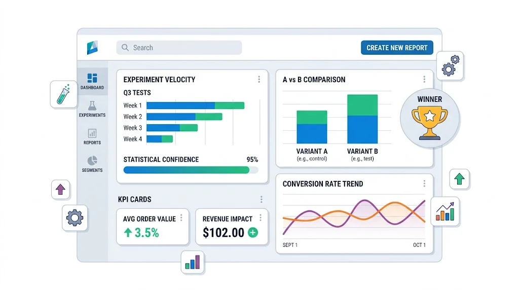
An A/B testing reporting dashboard makes your experimentation program legible — to your team, your management, and any investors who ask about your growth process. The right dashboard shows active test status, completed results, revenue impact from winners, and program-level metrics like testing velocity. This guide covers what to track, how to structure the dashboard, and the tools to build it with — starting with CustomFit.ai's built-in reporting and extending to custom setups for more advanced programs.
Most D2C teams spend their reporting effort on acquisition metrics — CAC, ROAS, email open rates. A/B test results get documented (if at all) in a spreadsheet that no one reviews.
The problem: without visible, accessible reporting:
Good reporting transforms your testing program from a cost center into a provably ROI-positive initiative.
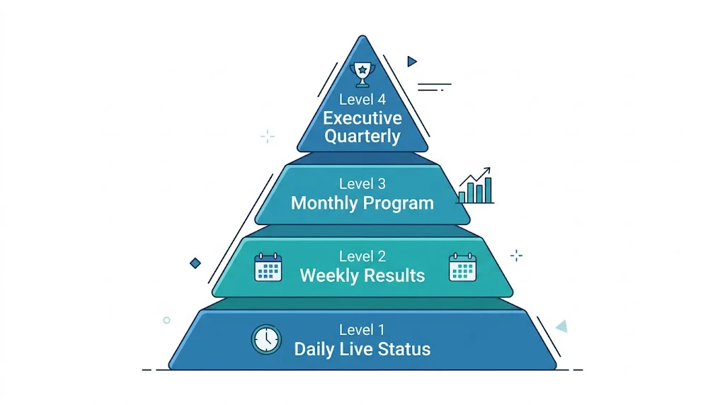
A view of all currently running tests with key status indicators. Your team checks this daily to confirm tests are functioning correctly.
Key fields:
Where to build it: CustomFit.ai's experiments dashboard provides this view natively. For teams wanting a consolidated view across multiple stores or tools, Looker Studio (free) with CustomFit.ai's data export works well.
A summary of tests that concluded this week with their results and decisions.
Key fields:
Report format: A simple weekly email to the team with 3–5 bullet points covering new results is often more useful than a formal dashboard. "Test T-014 (product page CTA button) concluded: variant lifts CVR from 1.9% to 2.4% (+26%), 97% confidence. Implementing. Estimated impact: ₹1.8 lakh/month."
A comprehensive view of the full testing program's performance over the past 30 days. Typically reviewed in a monthly team meeting.
Sections:
Program Velocity
Results Summary
Revenue Impact
Active Pipeline
A high-level summary for leadership, investors, or board review.
One-page format:
Q[X] 2026 A/B Testing Program Summary

Tests Completed: [N] (vs [N] last quarter)
Win Rate: [X%] of tests produced a winning variant
Revenue Impact: ₹[X] lakhs/month in incremental revenue from Q[X] winners
Top Win: [Test name] — [X%] CVR improvement on [page]

Testing Velocity: [Avg tests/month this quarter]
Program Efficiency: ₹[X] incremental monthly revenue per test completed

Q[X+1] Testing Focus: [2–3 bullet points on planned test areas]
This one-page view gives leadership all the information they need in 60 seconds.
Conversion rate per variant: The core metric. Show control and variant side by side.
Absolute improvement: Variant CVR minus control CVR, in percentage points. Easier for non-technical stakeholders to interpret than relative lift.
Relative improvement: (Variant CVR - Control CVR) / Control CVR × 100. The "X% improvement" number used in case studies.
Statistical confidence: Expressed as a percentage (95%, 97%, 99%). Confidence below 95% should be flagged as preliminary.
Revenue per session: Combines CVR and AOV. Often more meaningful than pure CVR for high-AOV D2C brands.
Testing velocity: Tests completed per month. Target: 2–4 for most D2C brands.
Win rate: Percentage of tests where a variant outperformed control. Industry average is 20–30% — most tests don't produce winners. A win rate above 40% may indicate tests are too safe (changes are too obvious) or statistical thresholds are too low.
Time to significance: Average days from test launch to a conclusive result. Long times indicate either insufficient traffic or overly conservative significance thresholds.
Revenue per test: Total incremental revenue from implemented winners divided by total tests run. This is the headline ROI metric of your testing program.
CustomFit.ai's experiments dashboard shows all active and completed tests, traffic allocation, real-time significance levels, and revenue impact estimates — all within the platform. For most Shopify D2C brands, this is sufficient without any additional dashboard tooling.
Access path: CustomFit.ai dashboard → Experiments → [Select test]
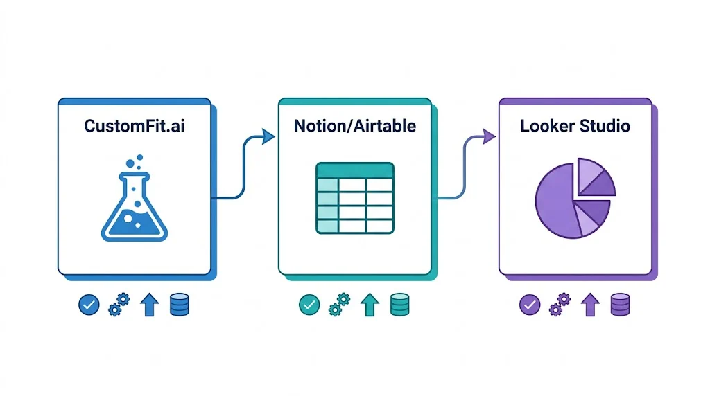
Connect CustomFit.ai results to a Notion database using Zapier. When a test completes, automatically create a Notion record with results pre-populated. The Notion database serves as both your test documentation archive and your program-level reporting roll-up.
Looker Studio (free) connects to Google Analytics 4, Google Sheets, and many testing tools via connectors. Build a custom dashboard that combines:
This gives you a unified view across all data sources — useful when you want to correlate test results with upstream traffic quality.
Airtable's dashboard view works well as a combined roadmap + reporting tool. Create a base with all tests, configure views for "Active Tests," "Completed Tests," and "Backlog," and add summary metrics at the top. Share with the full team as a live program dashboard.
Different stakeholders need different information from the same test result:
For your CRO/growth team: Full statistical detail — confidence levels, segment breakdown, sample sizes, guardrail metric performance. They need everything.
For leadership (CMO, CEO): Revenue impact and strategic implication. "We found that showing COD as the default payment option lifts checkout completion by 11% — we're implementing this today. Estimated impact: ₹3.2 lakh/month in additional revenue."
For investors: Program-level ROI narrative. "Our A/B testing program generated ₹18 lakh/month in incremental conversion revenue in Q3, representing a 340% ROI on testing tool costs. Average CVR improvement from 11% across brands like Bellavita demonstrates the model."
Automate result documentation. Set up Zapier triggers that automatically log test results to your master spreadsheet or Airtable base when tests conclude in CustomFit.ai. Manual documentation doesn't happen reliably.
Show the program impact in revenue, not just statistics. Leadership and investors understand rupees better than p-values. Always translate test results into estimated monthly revenue impact before presenting.
Flag inconclusive tests clearly. A test that ran for 30 days without reaching significance is not a "neutral" result — it's a signal that either the traffic is too low, the effect size is too small to detect, or the test was designed incorrectly. Flag these explicitly and determine which explanation applies.
Include segment highlights in every report. Even when reporting to non-technical audiences, a one-line segment finding ("mobile users responded 2x stronger than desktop users") adds depth and demonstrates analytical rigor.
Update the dashboard when tests are implemented. The most common reporting gap: a test wins, gets implemented, but the dashboard still shows it as "completed" rather than "implemented." Add an implementation column and update it within 24 hours of implementing winners.