From the conversion glossary
Concepts referenced in this article, defined.
Concepts referenced in this article, defined.
Run rigorous A/B tests and personalize every visit on Shopify or any storefront — no engineers required.
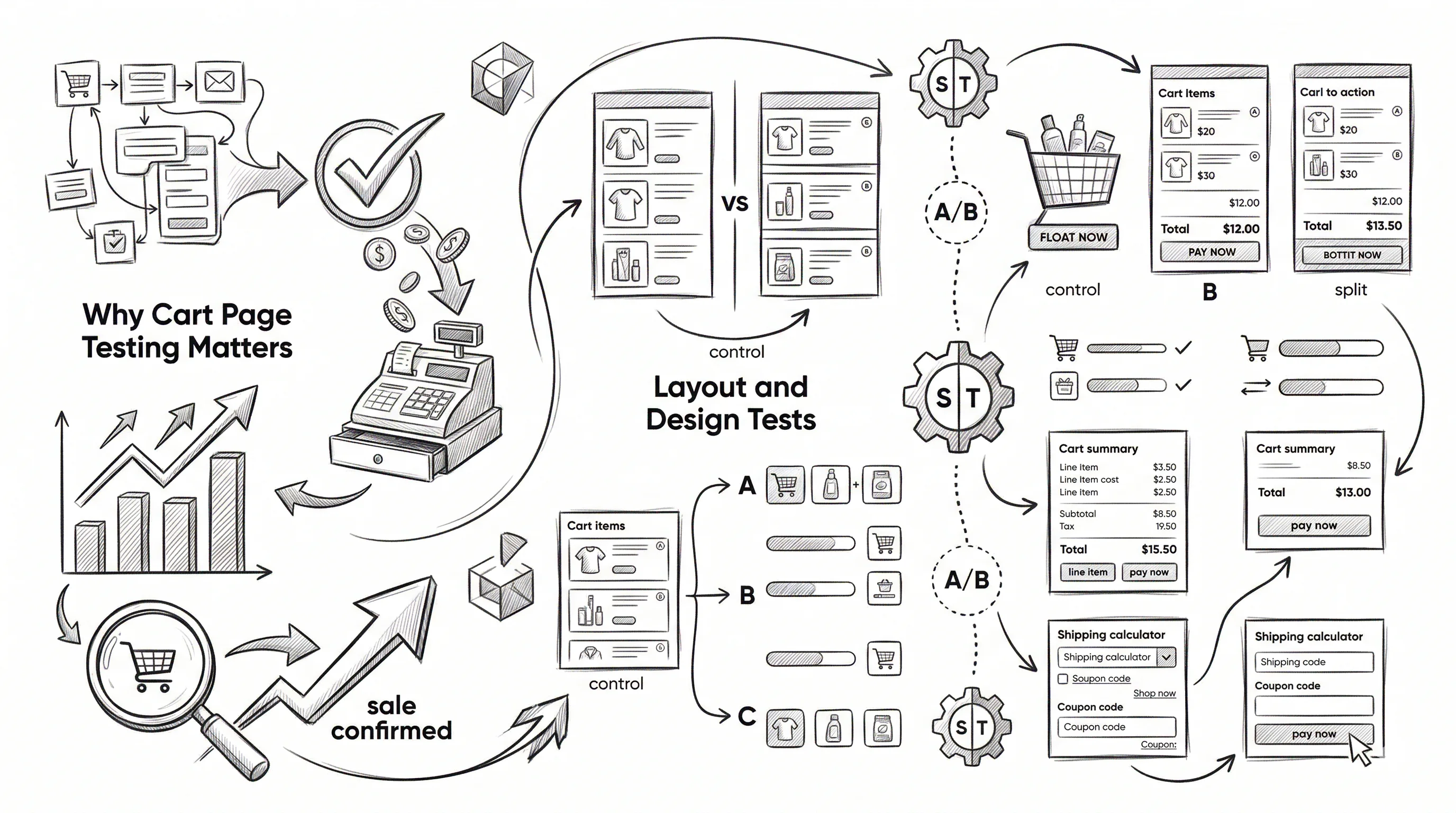
The cart page is the last stop before checkout — and for most D2C stores, the second-highest point of abandonment after checkout itself. A customer who has added products to cart has demonstrated clear purchase intent. The job of the cart page is to confirm their decision, add reassurance, and motivate them to take the next step. These 20 A/B test ideas address every element of the cart experience.
Average cart abandonment rates are 68–72% for ecommerce. For Indian D2C stores, this figure can be higher due to COD-preference uncertainty ("will it arrive safely?"), price sensitivity, and comparison shopping. A cart page test that lifts checkout initiation by 5% on a store with 100 cart additions per day generates 5 additional completed checkouts per day — compounding to 150 per month and 1,800 per year.
Split testing cart page elements is high-stakes: these are your highest-intent visitors. Every test should be designed to move them forward without creating new doubts or friction. Use a hypothesis-first approach: "We believe showing the free shipping progress bar will increase AOV by motivating customers to add one more product to qualify."
Variant A: Products add to a full dedicated cart page (separate URL) Variant B: Products add to a slide-out cart drawer (overlay on current page)
Cart drawers reduce friction for "check my cart and continue shopping" behaviour. Full cart pages allow more space for upsells and trust signals. Test by traffic source: mobile users tend to prefer drawers for speed; desktop users convert better on full pages for considered purchases.
Expected lift: 5–10% checkout initiation rate (result varies significantly by category).
Variant A: Product list stacked, checkout button below Variant B: Product list on left, order summary + checkout button on right (sticky on desktop)
A 2-column layout keeps the checkout button visible as the customer reviews their cart on desktop. This reduces the scroll-to-checkout friction that costs 3–7% of checkouts on single-column layouts.
Expected lift: 4–8% checkout initiation rate on desktop.
Variant A: Small thumbnail (60x60px) Variant B: Larger thumbnail (120x120px)
Larger thumbnails on the cart page help customers confirm what they've added — important for product variants (colour, size, flavour). Reducing uncertainty at this stage reduces second-guessing.
Variant A: Order total shown at the bottom of the cart Variant B: Order total shown in a sticky sidebar (desktop) or sticky footer bar (mobile)
Keeping the order total visible as customers scroll reduces the "surprise" of an unexpected total and maintains transparency throughout the cart review.
Variant A: Clicking "Remove" immediately removes the item permanently Variant B: Clicking "Remove" shows a brief "Item removed — Undo?" toast notification
The undo option converts a small but meaningful percentage of accidental or impulsive removals back into retained cart items. It also reduces the regret of impulsive removal decisions.
Expected lift: 2–5% cart recovery from accidental removals.
Variant A: Text message: "Add ₹250 more for free shipping" Variant B: Visual progress bar: "You're 75% of the way to free shipping! Add ₹250 more" with an animated fill
The progress bar gamifies the threshold achievement, tapping into the "endowment effect" — customers feel they've already started earning free shipping and don't want to lose that progress. This is the highest-impact cart page test for most stores.
Expected lift: 8–15% AOV increase; 6–10% checkout initiation rate improvement.
Variant A: No free gift offer Variant B: "Add ₹199 more and get a free [sample product]" with product image
A free gift threshold is more motivating than a cash saving threshold of equivalent value for some customer segments. The tangible nature of a gift (I'm getting something extra) outperforms abstract savings for impulse-eligible product categories.
Expected lift: 10–18% AOV increase for customers who engage with the offer.
Variant A: No payment preference messaging on cart page Variant B: "Pay now and save ₹100 — instant UPI/card discount" visible on cart
A prepaid incentive at cart can shift 15–20% of COD-preferring buyers to prepaid, improving unit economics through reduced return rates and COD handling costs. Test whether the revenue from reduced COD outweighs the discount cost.
Variant A: No delivery estimate on cart page Variant B: "Order now → Delivery by [specific date]" on cart page, above the checkout button
Specific delivery dates reduce "when will it arrive?" anxiety before checkout. For time-sensitive purchases (gifting, upcoming occasions), this is a high-impact conversion signal.
Expected lift: 5–10% checkout initiation rate for occasion-driven purchases.
Variant A: Line items show only the product price Variant B: Line items show product price, any discount applied, and saved amount: "₹799 (was ₹999 — you saved ₹200)"
Showing savings made reinforces the decision to buy and reduces buyer's remorse at the cart stage. This is especially effective for products on sale.
Variant A: No cross-sell on cart page Variant B: "Customers also bought" section showing 3 complementary products with "Add +" buttons
Cart-stage cross-sell sections with quick-add buttons see 8–15% take-rates for relevant, low-priced complementary items. The key is relevance — show products that genuinely complement what's in the cart.
Expected lift: 8–15% take-rate; 10–20% AOV increase.
Variant A: Cart shows individual products added Variant B: "You're one step away from our [Bundle Name] — add [product] for ₹X and save ₹Y" prompt
If a customer has 2 of 3 products in a bundle in their cart, a bundle upgrade prompt converting them to the full bundle at a discount increases AOV and delivers a better product experience.
Expected lift: 12–20% bundle conversion rate for customers with 2/3 bundle items.
Variant A: Generic "You might also like" section Variant B: Personalised "Based on what's in your cart, you might need..." recommendations
Personalised recommendations based on the specific cart contents outperform generic recommendations by 25–40% in click-through rate.
Variant A: No sample offer Variant B: "Choose a free sample to add to your order" with 3 product samples listed
Free sample opt-ins at cart serve dual purposes: they increase order satisfaction (customers feel they got something extra) and introduce customers to products they might repurchase. A win on both conversion and retention.
Expected lift: 5–10% checkout initiation for sample-attracted buyers; measurable impact on sample repurchase rate.
Variant A: Cart shows one-time purchase items Variant B: "Subscribe & Save 15% on your order — change to subscription?" offer below one-time items
A last-chance subscription offer at cart converts 5–12% of one-time buyers to subscribers for consumable product categories. High-LTV impact relative to effort.
Expected lift: 5–12% subscription conversion at cart stage.
Variant A: No trust badges on cart page Variant B: "Free returns | Genuine products | Secured payments | COD available" strip near the checkout button
A trust badge strip at the cart stage addresses checkout abandonment before it happens by pre-empting the most common objections.
Expected lift: 4–9% checkout initiation rate.
Variant A: No return policy on cart page Variant B: "Not happy with your purchase? Free return within 30 days — no questions asked" displayed near the checkout button
Return policy visibility at cart reduces last-minute hesitation for buyers who are risk-averse.
Expected lift: 4–8% checkout initiation rate.
Variant A: Checkout button without social proof Variant B: "Join 14,000+ happy customers who ordered this month" above the checkout button
Social proof at the final action point reduces the "am I making a mistake?" doubt.
Expected lift: 3–7% checkout initiation rate.
Variant A: No cart save option Variant B: "Share this cart on WhatsApp" button — allows sharing the cart link with family/partner
WhatsApp cart share serves two groups: customers making joint decisions (spouses deciding on a large purchase) and customers who want to resume later on a different device. Both increase final conversion.
Expected lift: 3–8% recovered carts from shared-cart visits.
Variant A: Visitors who exit the cart page are not engaged Variant B: An exit-intent popup triggers when the cursor moves to leave: "Wait — complete your order now and get free shipping" or "Your cart is saved — but items sell out fast"
Exit-intent popups on cart pages convert 3–8% of abandoning visitors. The offer needs to address the most likely objection for your category — shipping cost for price-sensitive buyers, scarcity for limited-stock products.
Expected lift: 3–8% recovery rate from cart-exiting visitors.
| Priority | Test | Expected Lift |
|---|---|---|
| 1 | Free shipping progress bar | 8–15% AOV |
| 2 | Trust badge strip near checkout | 4–9% initiation |
| 3 | Frequently bought with section | 8–15% take-rate |
| 4 | Exit-intent popup | 3–8% recovery |
| 5 | COD/prepaid incentive | Unit economics improvement |
Don't add so many upsell elements that the cart looks cluttered. A cart page with 3 cross-sell blocks, a progress bar, and a bundle upgrade offer can feel overwhelming. Test elements one at a time and evaluate whether the page still feels clean and trustworthy.
Segment by new vs. returning customers. New customers need more reassurance (trust badges, return policy). Returning customers need efficiency (saved addresses, express checkout). Personalise cart page experience by customer type.
Track AOV alongside checkout initiation rate. Some cart tests (free shipping threshold, bundle upgrade) are specifically AOV tests. Don't measure them only on initiation rate — track the full impact on revenue per session.
Related: checkout A/B testing ideas for the next stage and product page A/B testing ideas for the full funnel.