From the conversion glossary
Concepts referenced in this article, defined.
Concepts referenced in this article, defined.
Run rigorous A/B tests and personalize every visit on Shopify or any storefront — no engineers required.
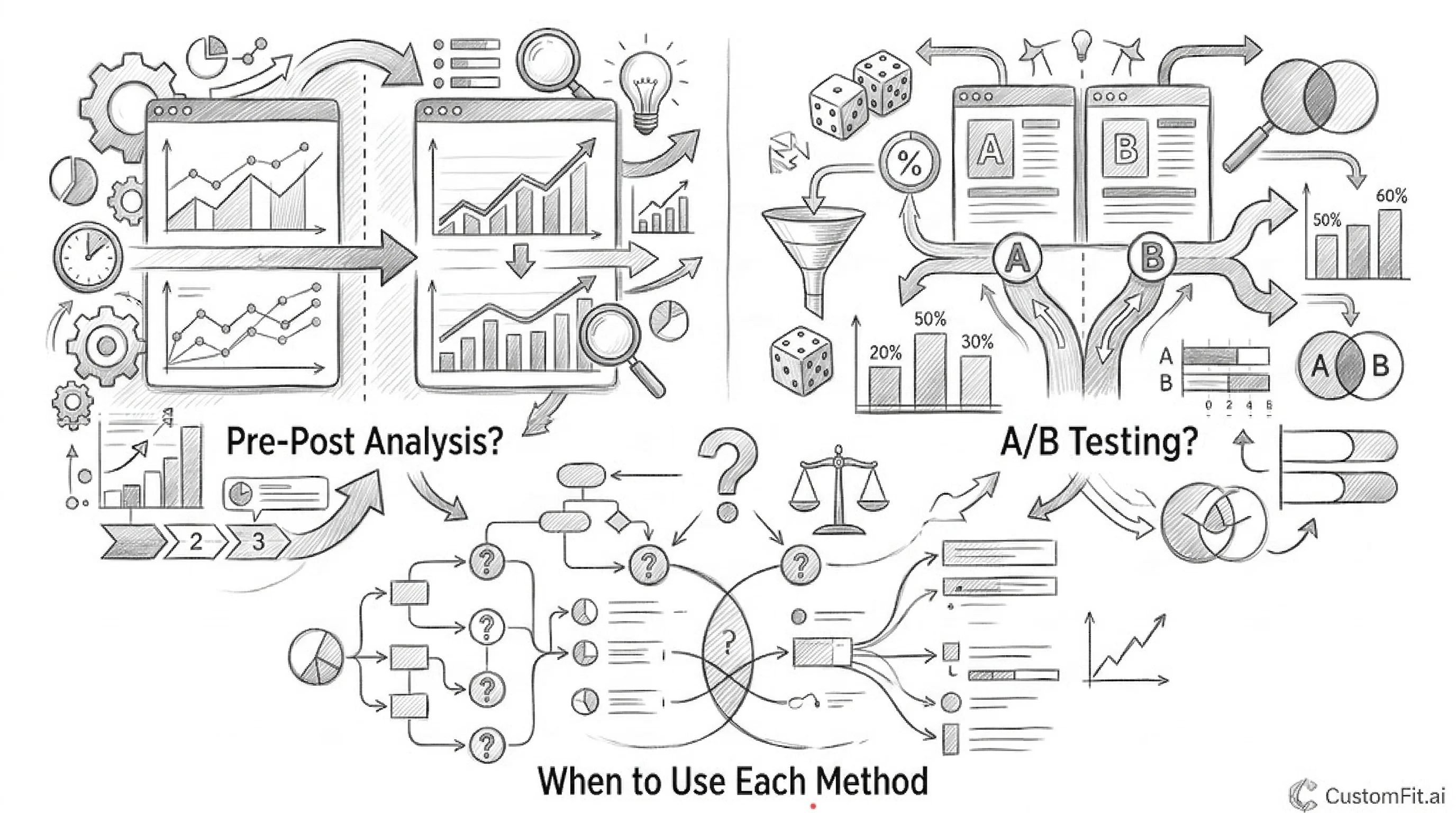
The pricing page is where interest becomes commitment. For SaaS tools like CustomFit.ai and for premium D2C subscription products, the pricing page is one of the highest-stakes pages on the site — and one of the most systematically undertested. A visitor who reaches the pricing page has already decided the product is relevant. The pricing page's job is to present the value clearly, remove objections, and make the right plan choice obvious. These 15 A/B testing ideas address every element of pricing page optimisation.
Pricing pages suffer from a specific form of decision paralysis: feature comparison overload, tier confusion, and the psychological weight of commitment. The best pricing pages resolve these problems through visual hierarchy, social proof, and risk reversal. Split testing pricing pages requires care — these are high-stakes pages for your revenue model — but the potential gains are among the largest available in your entire testing programme.
Kapiva saw a 9.48% CVR improvement through systematic testing of their product pages. Chargebee achieved 40% AOV lift through optimisation. These gains require the same discipline applied to pricing pages.
Variant A: All three pricing plans displayed with equal visual weight Variant B: Middle plan highlighted with "Most Popular" or "Recommended" badge, slightly larger card, and a contrasting background colour
When one plan is visually prominent, it becomes the "safe" choice — the one most people are picking, therefore the one I should pick. This reduces decision paralysis and typically increases conversion to the highlighted plan by 20–35%.
Expected lift: 20–35% conversion to the highlighted plan.
Variant A: 2 pricing plans (Starter and Pro) Variant B: 3 pricing plans (Starter, Growth, Enterprise)
Three-tier pricing creates a middle option that serves as the default choice for most buyers — avoiding the extremes of "too basic" and "too expensive." The middle plan in a 3-tier structure typically receives 50–60% of sign-ups.
Best for: SaaS tools and subscription services.
Variant A: Monthly pricing shown by default on page load Variant B: Annual pricing shown by default (monthly equivalent per month, billed annually)
Showing annual pricing by default anchors visitors to the lower monthly equivalent (e.g., ₹199/month billed annually = ₹2,388/year vs. ₹249/month billed monthly). This increases annual plan adoption by 15–25%.
Expected lift: 15–25% annual plan adoption rate.
Variant A: "Annual plan: ₹199/month (billed annually)" Variant B: "Annual plan: ₹199/month — Save ₹600 vs. monthly" Variant C: "Annual plan: ₹199/month — 2 months free"
"2 months free" framing is typically more emotionally resonant than "Save ₹600" because it quantifies the saving in product terms. Test which framing your audience responds to.
Expected lift: 8–15% annual plan adoption improvement.
Variant A: Full feature comparison table always visible Variant B: 5 key features visible; rest hidden behind "See All Features" expandable section
A collapsed feature table with the most important features visible reduces cognitive overload for buyers who don't need to evaluate every feature. "See All Features" exists for the buyers who do. This typically increases overall conversion by reducing paralysis.
Expected lift: 6–12% pricing page CVR improvement.
For pricing tied to usage (per visitor, per order, per seat):
Variant A: "₹249/month for up to 10,000 visitors" Variant B: "₹0.025 per visitor | ₹249/month for 10,000 visitors"
Per-unit pricing can make high-volume tiers feel more proportionate and fair — but for lower usage tiers, the flat monthly rate is clearer. Test which presentation reduces confusion and increases conversion for your specific pricing model.
Variant A: "Start Free Trial" Variant B: "Try Free for 14 Days — No Credit Card" Variant C: "Get Started Free"
"Try Free for 14 Days — No Credit Card" is the most specific and objection-resolving variant. It tells the visitor exactly what they're committing to (nothing), for how long (14 days), and removes the payment fear. This typically outperforms generic "Start Free Trial" by 15–25%.
Expected lift: 15–25% free trial sign-up rate.
Variant A: "No credit card required" shown only in fine print below the CTA button Variant B: "No credit card required" shown as a prominent statement in the CTA button itself: "Start Free Trial — No Card Needed"
The placement of "no credit card required" matters enormously. Buried in fine print, it's missed. In the CTA button, it removes the commitment fear at the moment of action.
Expected lift: 10–20% trial sign-up rate.
Variant A: Enterprise plan CTA: "Contact Sales" Variant B: Enterprise plan CTA: "Schedule a Demo" + "Get Custom Pricing"
"Schedule a Demo" is more actionable and lower-commitment than "Contact Sales" for enterprise prospects. It sets a clearer expectation (you'll see the product in action) rather than entering a sales conversation.
Expected lift: 15–25% enterprise inquiry rate.
Variant A: All plans shown with standard feature list Variant B: "Not sure which plan? Answer 3 questions" → recommends the right plan for the visitor's use case
A plan recommendation tool reduces the cognitive effort of choosing and converts uncertain visitors who might otherwise abandon. It's particularly effective for tools with complex pricing (CustomFit.ai's Starter at ₹8,199/month vs. Growth at ₹20,749/month distinction becomes clearer with the right context).
Expected lift: 12–20% conversion rate from uncertain visitors who use the recommender.
Variant A: CTA buttons only below the feature comparison table Variant B: CTA buttons both above the feature table (for buyers who don't need features) and below (for buyers who do)
Dual CTA placement captures the full spectrum of pricing page buyers — those who decide before reading features and those who decide after.
Expected lift: 5–10% overall pricing page CVR.
Variant A: No customer logos on pricing page Variant B: "Trusted by [8+ logos of recognisable brands]" above or below the pricing tiers
Customer logos on the pricing page reduce "is this legitimate?" doubt for buyers who are evaluating a purchase commitment. Logos of recognisable brands build instant category credibility.
Expected lift: 5–12% pricing page conversion rate for new visitors.
Variant A: Generic testimonial: "CustomFit.ai transformed our store" — Founder, Brand X Variant B: Results-specific testimonial: "We went from 2.1% to 3.4% CVR in 60 days using CustomFit.ai — a ₹8 lakh revenue increase" — Name, Brand
Specific result testimonials outperform generic ones by 3–5x in trust conversion because they quantify the outcome and give the prospect a benchmark for their own ROI calculation.
Expected lift: 10–18% pricing page conversion rate improvement from results-specific testimonials.
Variant A: Money-back guarantee in terms of service only Variant B: Prominent "30-Day Money-Back Guarantee" badge near each plan's CTA
A prominently displayed money-back guarantee reduces commitment fear at the decision point. It signals brand confidence and removes the financial risk of choosing the wrong plan or finding the product doesn't work.
Expected lift: 8–15% sign-up rate improvement.
Variant A: No FAQ on pricing page (links to separate support page) Variant B: 5–6 question FAQ directly on pricing page addressing: "What happens after my trial?" | "Can I change plans?" | "Is my data secure?" | "Do I need a developer?" | "What's included in setup?"
An on-page FAQ addresses the final objections that prevent pricing page conversion without requiring the visitor to navigate away. Each FAQ question should address a known objection from your sales or support team.
Expected lift: 6–12% pricing page conversion rate improvement.
| Test | Priority | Expected Lift |
|---|---|---|
| "Most Popular" plan highlighting | High | 20–35% on highlighted plan |
| Free trial CTA with "No Credit Card" | High | 15–25% sign-up rate |
| Annual pricing as default | Medium | 15–25% annual adoption |
| Results-specific testimonials | High | 10–18% conversion rate |
| FAQ on pricing page | Medium | 6–12% conversion rate |
| 3-tier vs. 2-tier pricing | High | Architecture decision |
| Money-back guarantee badge | Medium | 8–15% sign-up rate |
Treat pricing page tests as high-stakes experiments. Pricing page changes affect revenue model assumptions. Track statistical significance rigorously (95% confidence minimum) and run tests for full durations (14+ days) before making decisions.
Don't test actual prices without careful unit economics analysis. Price testing on a pricing page affects revenue per customer and LTV calculations. Run price tests only with clear financial modelling of the downstream impact.
Personalise pricing pages for known segments. A visitor from a Shopify Partner referral link has different context than an organic SEO visitor. CustomFit.ai's audience segmentation allows personalised pricing page experiences for known traffic sources.
Interview lost prospects before testing. The best source of pricing page test hypotheses is customers who visited and didn't sign up. Exit surveys and lost prospect interviews reveal the specific objections your tests should address.
Related: CTA button A/B testing ideas and checkout A/B testing ideas for complementary conversion optimisation across the full funnel.