From the conversion glossary
Concepts referenced in this article, defined.
Concepts referenced in this article, defined.
Run rigorous A/B tests and personalize every visit on Shopify or any storefront — no engineers required.
The header is the most universally viewed element on your ecommerce site—it appears on every page, every session. Shoppers use it to navigate, search, and access their cart. A well-designed header reduces friction, accelerates product discovery, and increases checkout initiation. A poorly designed one causes confusion, buries important navigation, and creates the impression of an amateur store that erodes purchase confidence.
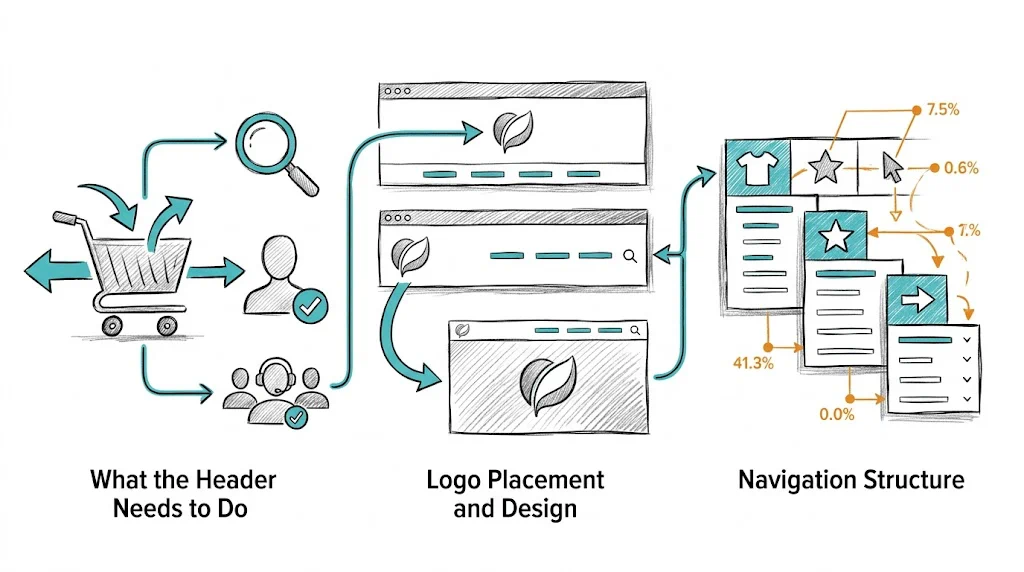
Before diving into design details, be clear on the header's jobs:
Every design decision should serve one of these five functions. If a header element does not serve any of them, reconsider its presence.
Position: Center-aligned logos are increasingly common and work well for brand-forward D2C brands. Left-aligned logos are the traditional standard and have stronger navigation convention (clicking a logo always returns to homepage).
For Indian D2C brands with expressive visual identities (beauty, fashion, lifestyle), center-aligned logos create a premium feel. For brands where navigation efficiency matters most (high-SKU stores, utilitarian categories), left-aligned logos are more functional.
Size: Logo should be legible at the intended header height. Do not shrink a complex logo to the point where it is illegible—use a simplified version (mark only, or wordmark) for the header if needed.
Alt text: Set descriptive alt text for the logo image: alt="YourBrand - Organic Skincare". This serves both accessibility and SEO.
The main navigation determines how well shoppers can find what they are looking for:
Top-level items: Limit to 5–7 items in the main navigation. More than 7 creates visual noise and decision paralysis. Common top-level structure for D2C brands:
Dropdown vs. mega menu: For brands with more than 10 subcategories, a mega menu (see our guide on ecommerce mega menu design) is more navigable than nested dropdowns. For brands with 5–10 subcategories, a simple dropdown works.
Avoid "More" menus: Navigation items hidden behind a "More" dropdown are almost never clicked. If it is important enough to be in the navigation, give it a visible slot. If it cannot fit, reorganize your IA.
Active state styling: The current section should be highlighted in the navigation (bold, underline, or color change). This orientation cue reduces "where am I?" confusion.
The search bar placement and prominence directly affect search usage—and high-intent search users convert at 3–5x non-searchers.
Visible search bar: A full-width search bar (or a prominent magnifying glass icon that expands) in the header center performs better than a small icon tucked in the corner.
Placeholder text: Use descriptive placeholder text that suggests search: "Search for products, ingredients..." not just "Search." This primes shoppers to search broadly.
Autocomplete: Activating search suggestions as the user types increases search engagement and reduces zero-result queries. See our full guide on ecommerce site search optimization.
Mobile search: On mobile, the search icon should be one of the most prominent header elements. A search icon that is smaller than 44×44px is too small to tap reliably.
The cart icon is the most commercially important header element—it is the path to checkout:
Placement: Far right of header, always visible. Never tuck it into a menu or make it a text link.
Cart count badge: A red (or brand-color) bubble showing the number of items in cart is standard and expected. Removing it breaks user expectations. Update the count dynamically as items are added.
Cart hover/click behavior: On desktop, a cart flyout (showing product thumbnails, quantities, total, and a checkout CTA) that appears on hover or click converts better than requiring navigation to a separate cart page. Shoppers can confirm their selection and proceed to checkout without losing context.
Mobile cart behavior: On mobile, the cart icon should navigate to a full cart page (not a flyout). The full cart page gives more space for upsell, shipping threshold messaging, and checkout CTA.
An announcement bar above the main header communicates offers, shipping thresholds, or news:
When to use: Active sale, free shipping threshold ("Free shipping above ₹499"), new product launch, festive promotion.
When not to use: Generic messages ("Welcome to our store!"), repeated messages shoppers have already dismissed, or non-urgent information that belongs on an About page.
Dismissibility: Make it dismissible with a clear × button. A dismissible bar that remembers the choice (via cookie) shows once per session/day—respecting the user's attention.
Personalization: Use CustomFit.ai to show different announcement bar messages to different segments—new visitors see a welcome offer, returning visitors see "Reorder your favorites with 10% off," international visitors see "Ships worldwide."
A sticky (fixed) header stays visible as the user scrolls, keeping navigation accessible. Implementation best practices:
Slim sticky version: The full header with announcement bar + logo + full navigation stacked can be 100–150px tall. As the user scrolls, collapse to a slimmer version showing only logo, search icon, cart icon, and possibly the top-level navigation. This retains utility while maximizing content space.
Scroll trigger: Start the sticky transition after the user has scrolled 100–200px, not immediately. Immediate sticking feels aggressive on landing.
Background: Ensure the sticky header has a solid background (white, brand color) rather than transparent—it must remain legible over all page content.
Mobile sticky: On mobile, the sticky header should be minimal: just logo + search + cart + hamburger menu icon. 60–70px maximum height on mobile.
Account icon: Visible in the header with a clear visual treatment. On hover/click: show "Sign In" for guests, "My Account / Orders" for logged-in users. Returning customers should see their name or account indicator.
Wishlist icon: For fashion and beauty brands where wishlist usage is high, a heart icon in the header encourages wishlist saving behavior. Shows count of saved items for logged-in users.
Customer service: A help icon or phone/chat link in the header header provides reassurance that support is available. For brands with WhatsApp support, a WhatsApp icon in the header drives direct inquiry and reduces uncertainty at the purchase decision stage.
Header changes worth testing with CustomFit.ai:
aria-label attributes so screen reader users understand their function.Related reading: Conversion Rate Optimization | Shopping Experience | A/B Testing | Ecommerce Mega Menu Design | Ecommerce Footer Optimization
See also: D2C & Ecommerce Growth Pillar