From the conversion glossary
Concepts referenced in this article, defined.
Concepts referenced in this article, defined.
Run rigorous A/B tests and personalize every visit on Shopify or any storefront — no engineers required.
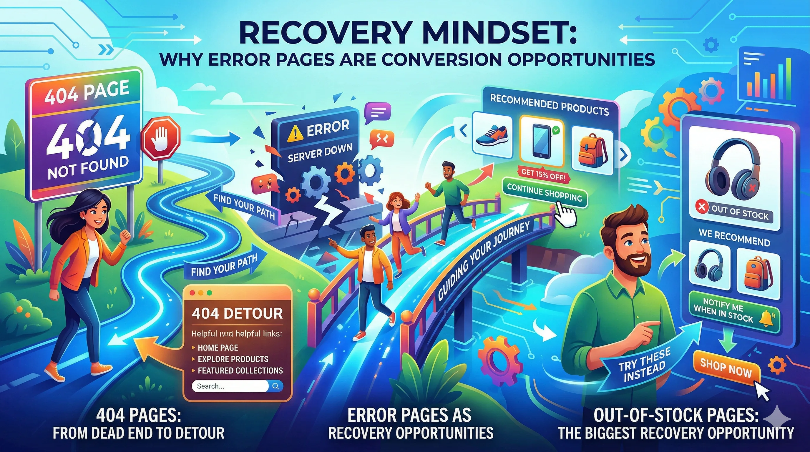
Error pages — 404s, out-of-stock pages, failed checkout screens — are where most ecommerce stores give up on a visitor. A poorly designed error page sends a buyer away permanently. A well-designed error page recovers them, redirects them, and often closes the sale anyway. Designing for recovery means treating every error as a detour, not a dead end.
When a visitor hits an error page, their first instinct is to leave. That is the default. The job of a well-designed error page is to interrupt that instinct with a useful alternative before the visitor decides the effort is not worth it.
The cost of not thinking about this is real. A D2C brand running a festive sale campaign might have 5–10% of their traffic hit out-of-stock pages as popular products sell out during peak hours. Without a recovery path, that traffic is completely wasted. With a well-designed OOS page that offers a waitlist and similar products, a meaningful share of those visitors can still convert — either now on an alternative, or later when the product restocks.
The three categories of ecommerce error pages that need recovery design:
The default 404 page on most platforms says some version of "Oops! Page not found." and offers a link to the homepage. This recovers a small fraction of visitors — the highly motivated ones who will find their way regardless. Everyone else bounces.
Common causes of 404 errors in D2C stores:
A converting 404 page does three things:
1. Acknowledges the problem briefly Keep the error message short and human. "We couldn't find that page" is better than "404 Error: The requested resource was not found." No technical language.
2. Offers a search bar prominently If the visitor came looking for something specific, let them search for it directly from the 404 page. A search bar is the highest-recovery tool on any error page.
3. Surfaces high-value alternatives Show 3–4 popular products, top categories, or current sale items. Give the visitor something to click that might match what they were looking for.
Optional but effective for Indian D2C:
Your custom 404 page design must be served with a 404 HTTP status code, not 200. A custom 404 page with a 200 status is called a "soft 404" and will be indexed by search engines as a real page, diluting your SEO. Most platforms (Shopify, WooCommerce) handle this correctly by default — but verify after custom template changes.
Out-of-stock pages are the error pages with the most revenue-recovery potential. A visitor on an OOS product page wanted to buy that exact product — they have intent and interest. The question is what you do with that intent.
The most effective recovery tool. "Notify me when this is back in stock" with an email and/or WhatsApp notification option captures the visitor's intent for a future conversion.
Implementation tips:
For Shopify brands, apps like Back in Stock (BIS) handle this automatically.
Show 3–4 products that are similar to the sold-out item. The algorithm matters here: recommending a completely different category is useless. Recommendations should match on:
Label the recommendations clearly: "Similar products you might like" is more honest and more effective than "You might also like" (which sounds like an upsell, not a helpful alternative).
For high-demand products, a waitlist or pre-order option recovers visitors who want the specific product and are willing to wait or commit in advance.
Pre-order with a partial payment (₹50–₹200 as a token) works especially well during festive season when popular products sell out early but restock before Diwali. The partial payment captures commitment without the full purchase burden.
Checkout errors are the most expensive error type because the visitor was literally in the act of buying. Every checkout error that is not handled gracefully loses a near-converted customer.
Payment failure: UPI timeout, card decline, net banking session expiry Address error: Undeliverable pincode, incomplete address Cart conflict: Item sold out between add-to-cart and checkout Session timeout: Visitor took too long on the payment page
Preserve the cart. Never lose the cart contents when a checkout error occurs. The visitor must be able to retry payment without re-adding every item. This sounds obvious but is broken on many D2C stores — especially after UPI timeouts.
Show a specific, human-readable error message. "Payment failed" is useless. "Your UPI payment timed out — please try again or use a different payment method" tells the customer exactly what happened and what to do next.
Offer alternative payment methods immediately. If UPI failed, show "Try Net Banking or Card" with one tap. If a card declined, suggest "Try COD if available" or a different card. The visitor wants to buy — make it easy to try again.
Do not make the visitor re-enter their address. Address and cart data should be preserved across payment retries. Requiring customers to re-type their address after a payment failure is a significant drop-off driver.
Auto-retry for minor failures. For payment gateway timeouts (not declined cards), a single automatic retry after 3 seconds is acceptable. If it fails again, show the error clearly.
A product that sells out between the time a visitor adds it to cart and the time they reach payment is a special case. The correct handling:
Do not fail the entire checkout because one item sold out. Salvage what you can.
Unlike standard page A/B testing, error page testing is difficult because you cannot easily split traffic to error scenarios. Instead:
Run usability tests by asking 3–5 users to "find a product that was sold out" on your store and observe how they navigate from the OOS page.
Audit 404s monthly. Google Search Console reports all crawled 404 errors. Set up a monthly review and redirect any high-traffic 404s to the most relevant live page.
Set up redirects for deleted products. When you delete a product or change its URL, add a 301 redirect to the most similar available product. This preserves both SEO value and user experience.
Keep error page copy human. Avoid technical jargon. Write error pages in the same voice as your brand's regular copy.
Add UX testing to error pages. During your next UX audit, specifically test the flow from an OOS page and a 404 page. These are often completely overlooked in standard audits.
For more on optimising the ecommerce experience, see the UX pillar guide and the UX audit checklist.