From the conversion glossary
Concepts referenced in this article, defined.
Concepts referenced in this article, defined.
Run rigorous A/B tests and personalize every visit on Shopify or any storefront — no engineers required.
Mobile bottom navigation puts your store's most-used sections in the thumb zone — the easiest-to-reach area of a mobile screen. For ecommerce stores where 70%+ of traffic is mobile, bottom navigation reduces the effort of moving between browsing, searching, cart, and account. The result is more sessions that go deeper, more products discovered, and more add-to-cart events. This guide covers how to design, implement, and test mobile bottom navigation for D2C ecommerce.
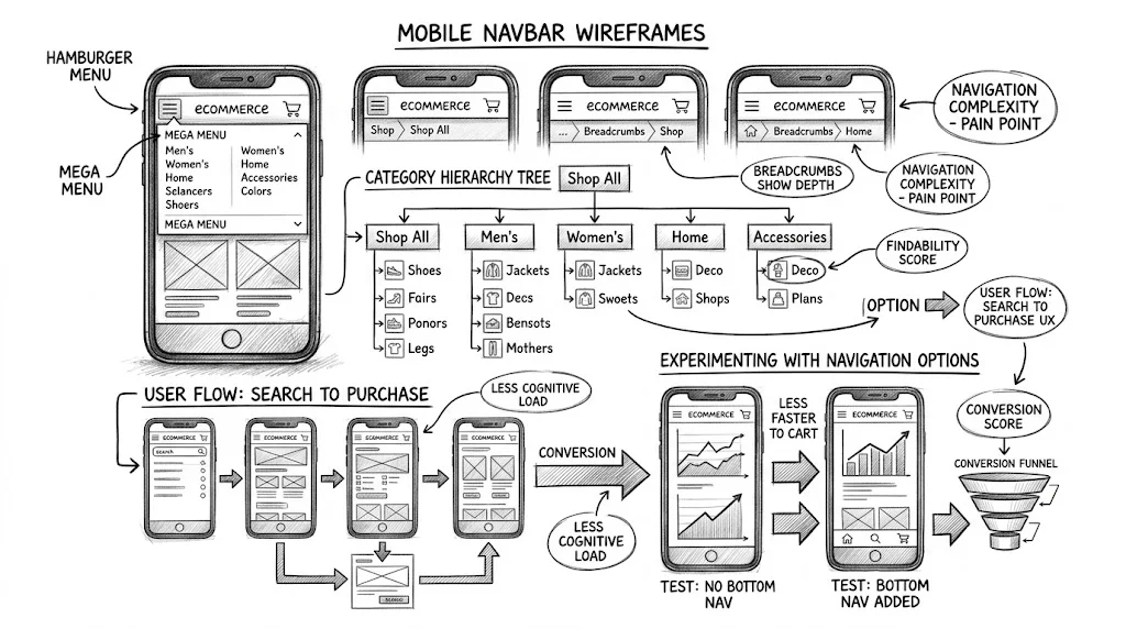
The hamburger menu (three horizontal lines at the top-left corner) was a compromise born from the constraints of early smartphones. It hides navigation behind a tap to save screen space. The problem: the top-left corner of a phone is one of the hardest areas to reach with one hand. Tapping the hamburger requires a thumb stretch that interrupts browsing flow.
Bottom navigation places the same links in the bottom-centre area of the screen — comfortably within thumb reach without repositioning the hand. The difference in accessibility is significant enough that most major ecommerce apps (Amazon, Myntra, Nykaa, Meesho) have adopted bottom navigation as their primary mobile navigation pattern.
For websites (as opposed to apps), bottom navigation is less standard but increasingly used. D2C brands with Shopify stores can implement bottom navigation through theme customisation or app plugins. The conversion impact comes from reduced navigation friction: visitors who can easily reach "Categories" or "Cart" from anywhere on the page browse more and abandon less.
The standard five-tab structure for D2C ecommerce:
The home icon (house) is the standard. Links to the homepage. This is the "reset" button — visitors use it to start over when they have navigated somewhere they did not want to be.
A grid or list icon. Links to the main category page or a full category menu. This is the most-used tab after home for discovery-mode shoppers.
Consider labelling this "Shop" rather than "Categories" — it is more action-oriented and matches the visitor's intent ("I want to shop") better than a structural label.
A magnifying glass icon. Links to the search overlay or search results page. In India, direct search for product names is a common navigation pattern, particularly for repeat purchasers who know what they want. Prominent search access reduces the number of taps needed to reach a specific product.
Some stores combine Categories and Search into one tab, but separating them gives each enough prominence. If you must choose one, search is more valuable for stores with large catalogues.
A shopping bag or cart icon with a badge count. Links to the cart page. The badge count (showing the number of items in the cart) serves a dual purpose: navigation convenience and conversion nudge.
The badge creates a persistent visual reminder that the user has items waiting. Every screen the user visits shows "2 items in cart" — a subtle prompt to complete the purchase. Cart badge counts are one of the small UX details that contribute to checkout initiation without any friction.
A person icon. Links to the account login/dashboard page. For returning customers managing orders, tracking deliveries (especially important for COD orders in India), or accessing loyalty points, direct account access reduces friction.
56–64px is the standard for mobile bottom navigation. This provides enough touch target height for reliable tapping while not consuming excessive screen space on 5-inch displays.
Taller than 64px starts to feel intrusive on small screens. Shorter than 52px produces touch targets that are difficult to tap reliably.
On iPhones with the home indicator bar (iPhone X and later), the bottom 34px of the screen is the iOS "safe area". Your bottom navigation must either:
env(safe-area-inset-bottom) in CSS to dynamically adjust for the deviceFailure to handle the safe area results in the navigation bar content being clipped or overlapping with the iOS home indicator — a clearly broken experience.
On Android, most devices have software navigation (back, home, recents buttons) that can be hidden. When the system navigation is hidden, the bottom of the screen is fully available. When it is visible, your app needs to account for it. Use WindowInsets in web contexts or ensure the bar is positioned appropriately.
Each tab should have an icon (24×24 pixels minimum) and a label (11–13px text). Icon-only navigation without labels creates confusion for first-time visitors who cannot distinguish between similar icons. Labels like "Shop", "Search", "Cart", "Account" eliminate guessing.
Label font should match your brand's body text. All-caps labels in a small font are acceptable and common.
The selected tab must have a clearly different visual state — typically the brand's primary colour on the active icon, with inactive tabs in grey. Without a clear active state, users cannot tell where they are in the navigation.
The cart badge should be:
Product pages: The bottom navigation should be visible, but the cart icon should reflect the current cart state. Some stores hide the bottom navigation on product pages to focus the user on the product and the ATC button. This is a testable decision — hiding it may increase product page focus but reduce the path back to browsing.
Checkout: Hide the bottom navigation on checkout pages. Checkout is a focused flow with one destination. Navigation tabs are distractions.
Landing pages from paid ads: For landing pages that are designed for direct conversion (no browsing), hide the bottom navigation. Landing pages should not have navigation that takes visitors away from the conversion goal.
Search results: Show the bottom navigation. Users in search mode are often comparing options and may want to quickly jump back to a category or the cart.
Some stores use a sticky top header with the logo, search, and cart icons that stays visible while scrolling. This is an alternative to bottom navigation, not a complement — having both a sticky header and a bottom navigation bar takes too much screen space.
The trade-off:
For high-traffic mobile-first D2C stores, bottom navigation tends to win on depth metrics. Test which pattern your audience prefers — it depends on how much of your traffic is discovery-mode vs. direct-intent.
To measure the impact of adding or changing bottom navigation:
| Test | Control | Variant |
|---|---|---|
| Navigation style | Hamburger top menu | Bottom 5-tab navigation |
| Tab order | Home / Shop / Search / Cart / Account | Home / Search / Shop / Cart / Account |
| Categories tab label | "Categories" | "Shop" |
Primary metrics:
Duration: 2–4 weeks to account for new vs. returning visitor mix.
Note that changing navigation structure has a learning curve — first-week data may understate the long-term impact as users adapt to the new navigation.
Do not add more than 5 tabs. Six tabs require icons and labels too small to tap reliably on budget devices. If you have 6 items to navigate to, combine two (e.g., combine Categories and Collections into one tab with a flyout menu).
Use your highest-traffic sections as tabs. Analyse your Google Analytics to find the top 4–5 navigation destinations for mobile users. Those are the tabs that belong in the bottom navigation.
Animate the cart badge. A subtle bounce animation when the cart count changes (after add-to-cart) is a microinteraction that calls attention to the cart count increase without being intrusive.
For festive campaigns, consider temporary tab changes. During Diwali, replacing one tab with "Sale" or "Festive Gifts" for 2 weeks can drive higher festive sale engagement without a full navigation redesign.
For more on ecommerce UX, see the UX pillar guide and related articles on infinite scroll vs pagination and sticky add-to-cart buttons.