From the conversion glossary
Concepts referenced in this article, defined.
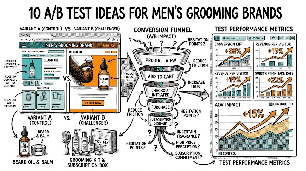
30 real A/B testing examples across product pages, checkout, homepage, and email — with results, hypotheses, and what to test first on your ecommerce store.
Concepts referenced in this article, defined.
Run rigorous A/B tests and personalize every visit on Shopify or any storefront — no engineers required.
Most articles about A/B testing give you theory. This one gives you 30 real tests — with actual hypotheses, what changed, and what happened. Some won big. Some were inconclusive. Both kinds teach you something.
If you're running a D2C brand in India — whether you're selling skincare, supplements, apparel, or electronics — these examples map directly to the decisions you're making every day on your product pages, homepage, and checkout flow.
Ready to stop guessing and start testing? Let's get into it.
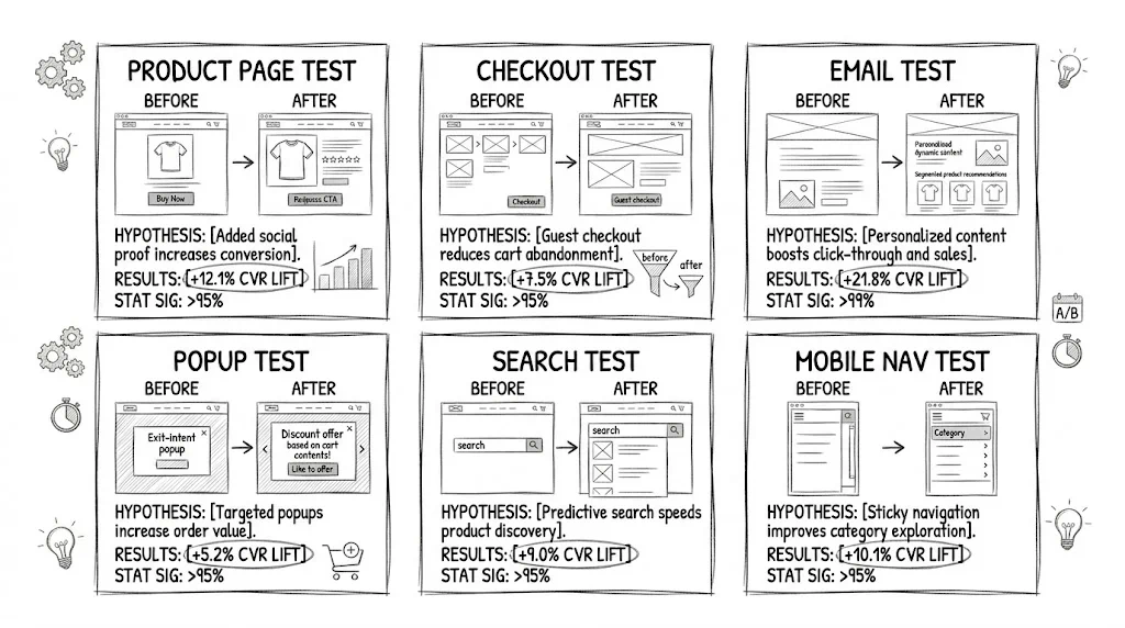
Your product page is where purchase decisions are made. It's where attention, skepticism, and intent collide. These five tests show what actually moves the needle.
Hypothesis: We believed switching from a feature-led headline ("SPF 50+ Broad Spectrum Sunscreen") to a benefit-led one ("No White Cast. No Greasy Feel. Just Protected Skin.") would increase add-to-cart rate because Indian consumers shopping for skincare online respond more to outcome promises than ingredient specs.
What was tested:
Result: +18% lift in add-to-cart rate | The benefit-led variant won convincingly. The lesson: lead with what the product does for the customer, not what it contains. Feature details can live lower on the page.
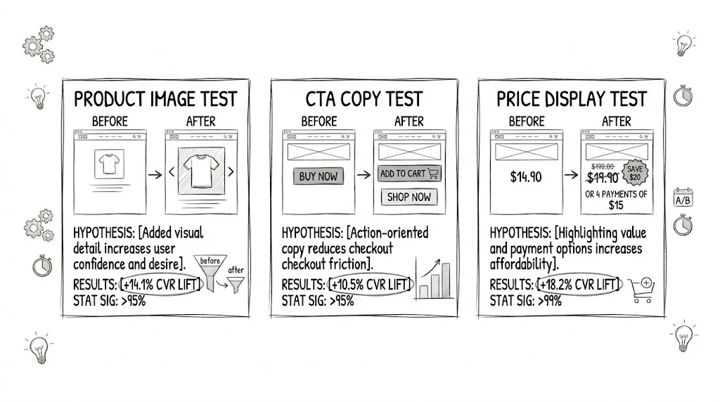
Hypothesis: We believed showing a real customer using the product (UGC-style image) would outperform a studio product shot because it builds authenticity and reduces purchase hesitation.
What was tested:
Result: Variant B (UGC) +23% | Variant A (lifestyle) +9% | The UGC image dramatically outperformed the studio shot. Real people, real results — buyers trust it more than polished photography.
Hypothesis: We believed changing the CTA from "Add to Cart" to "Add to Bag — Free Delivery Above ₹499" would increase conversions by surfacing a purchase incentive at the moment of decision.
What was tested:
Result: +11% lift in add-to-cart clicks | Embedding a micro-incentive into the CTA copy reduced friction at the key decision point. Worth testing on every ecommerce store above a certain order volume threshold.
Hypothesis: We believed showing an EMI option prominently below the price ("or ₹833/month with no-cost EMI") would increase conversions for a ₹9,999 product because it reduces sticker shock for price-sensitive buyers.
What was tested:
Result: +14% lift in purchase conversions | Smaller perceived cost = more buyers. This is especially effective for products above ₹3,000 where EMI is available.
Hypothesis: We believed moving the star rating and review count from below the product description to directly under the product title would increase add-to-cart rate by surfacing trust signals earlier.
What was tested:
Result: +9% lift in add-to-cart | Placement matters as much as the proof itself. Reviews buried at the bottom might as well not exist for the majority of users who don't scroll that far.
Your homepage sets expectations. First impressions here determine whether a visitor clicks deeper — or bounces.
Hypothesis: We believed a problem-solving headline ("Tired of Skincare That Breaks You Out?") would outperform a brand-aspirational one ("Skin That Speaks for Itself") because it speaks directly to a pain point, creating immediate relevance.
What was tested:
Result: +16% lift in homepage-to-product-page click-through | Problem-solution framing creates urgency that aspirational language rarely matches. If your customer has a specific frustration, name it.
Hypothesis: We believed a time-sensitive offer in the announcement bar ("Sale ends in 4 hours") would outperform a static free delivery message because urgency drives immediate engagement.
What was tested:
Result: Inconclusive | Urgency worked during actual sale periods but underperformed versus the free shipping message during non-sale weeks. The lesson: static trust signals (free shipping) outperform manufactured urgency outside of genuine sale events.
Hypothesis: We believed replacing a generic "Shop Now" CTA with two category-specific CTAs ("Shop Moisturisers" and "Shop Serums") would increase click-through rate because it helps visitors self-select faster.
What was tested:
Result: +21% lift in above-fold CTA clicks | Specificity wins. When visitors don't know where to start, a generic CTA doesn't help them. Category-specific CTAs reduce decision paralysis.
Hypothesis: We believed a "Loved by 1.2 lakh customers" message would outperform press logo strips because it signals popularity rather than media validation — which matters more to first-time D2C buyers.
What was tested:
Result: +8% lift in scroll depth and add-to-cart from homepage visitors | For brands with strong customer numbers, social proof from real buyers outperforms media logos. If you have fewer than 10,000 customers, press logos may still be the stronger signal.
Hypothesis: We believed simplifying navigation from 8 top-level items to 4 (with a "Best Sellers" link added) would reduce cognitive load and increase product page visits.
What was tested:
Result: +13% increase in product page visits from homepage | Fewer choices = more clicks. The "Best Sellers" shortcut was the single highest-clicked nav item in the variant.
Cart abandonment at checkout is where money actually leaks. These tests address the specific friction points in an Indian ecommerce checkout flow.
Hypothesis: We believed removing the mandatory account creation step and offering guest checkout as the default would reduce checkout abandonment because forcing account creation adds friction for first-time buyers.
What was tested:
Result: +31% lift in checkout completion | This is one of the highest-impact tests in ecommerce. Forced account creation is a conversion killer — especially for mobile-first, first-time buyers.
Hypothesis: We believed listing UPI (Google Pay, PhonePe, Paytm) as the first payment option would increase payment completion rate because UPI is the preferred payment method for 60%+ of Indian online shoppers.
What was tested:
Result: +17% lift in payment completion | Match your payment UI to actual user behaviour. For Indian D2C stores, UPI-first is non-negotiable.
Hypothesis: We believed adding "Secure Checkout" and "Easy 7-Day Returns" trust badges directly above the "Place Order" button would reduce last-second abandonment.
What was tested:
Result: +8% lift in order completion | Trust signals placed at the exact moment of commitment reduce hesitation. COD availability as a badge is particularly effective for first-time buyers who are uncertain about online payments.
Hypothesis: We believed adding a visible step indicator (Step 1 of 3: Address → Step 2: Delivery → Step 3: Payment) would reduce checkout abandonment by setting clear expectations.
What was tested:
Result: +12% lift in checkout completion rate | When buyers can see the end of the tunnel, they're more likely to keep going. This is a low-effort, high-return test for any multi-step checkout flow.
Hypothesis: We believed keeping the order summary expanded and always visible on desktop checkout would reduce abandonment by letting buyers confirm their selection at every step.
What was tested:
Result: Inconclusive on mobile | +9% on desktop | On mobile, a collapsed summary reduced scroll length and was preferred. On desktop, the always-visible summary performed better. Segment your test by device type for checkout pages.
Category pages are the shelf of your online store. How you organise and display products here directly impacts what gets bought.
Hypothesis: We believed defaulting to "Best Sellers" instead of "Newest" would increase click-through to product pages because social validation guides browsing behaviour.
What was tested:
Result: +19% increase in product page visits from category pages | Most visitors don't have a specific product in mind — they want guidance. Best sellers provide that social signal.
Hypothesis: We believed showing filters in a persistent sidebar (on desktop) rather than behind a "Filter" button would increase filter usage and purchase rate.
What was tested:
Result: +24% filter usage, +7% add-to-cart from category pages | When filters are visible, buyers use them. When they're hidden, buyers scroll less and buy less. Make filters accessible on desktop.
Hypothesis: We believed adding key product callouts (key ingredient, skin type, size) to product cards would reduce clicks-to-decision by giving buyers more information before they click.
What was tested:
Result: +11% add-to-cart from category page (without visiting product page) | Richer product cards reduce the need to click into a product page, shortening the path to purchase for confident buyers.
Hypothesis: We believed adding a quick "Add to Cart" button directly on the product card would increase add-to-cart rate by reducing the steps needed to purchase.
What was tested:
Result: +26% add-to-cart events, but -4% in average order value | The quick-add button increased volume but slightly reduced AOV (buyers were adding fewer items per session). Net revenue positive, but worth monitoring. Good for repurchase-heavy SKUs.
Hypothesis: We believed offering a list view option (with longer product descriptions visible) would benefit text-heavy categories like supplements but not apparel.
What was tested:
Result: Inconclusive overall | Supplements category saw +8% purchase rate in list view. Apparel saw no difference. Segment by category before deploying universally.
The cart is the last stop before checkout. These tests reduce the gap between "items in cart" and "order placed."
Hypothesis: We believed placing product recommendations above the cart item list ("Customers also bought") would generate more upsell clicks than placing them below the subtotal.
What was tested:
Result: +34% upsell click-through | Placement above the fold in the cart dramatically increases visibility and interaction with recommendations. This one is almost always worth testing.
Hypothesis: We believed showing a dynamic "You're ₹250 away from free shipping" progress bar would increase average order value by motivating buyers to add one more item.
What was tested:
Result: +₹180 increase in average order value | One of the highest-ROI cart experiments. Dynamic threshold messaging works because it makes the reward feel tangible and reachable.
Hypothesis: We believed adding "Securely" to the checkout CTA would reduce hesitation by addressing payment security concerns inline.
What was tested:
Result: +6% lift in checkout initiation | Small copy change, meaningful result. Security language matters for first-time buyers and for categories like health and personal care where trust is paramount.
Hypothesis: We believed a horizontal cart layout (image on left, details on right in a row) would perform better on desktop than the default vertical stacked list.
What was tested:
Result: Inconclusive on mobile, +5% checkout initiation on desktop | Layout matters more on desktop. For mobile-first stores (80%+ of Indian D2C traffic is mobile), vertical stacks remain the standard.
Hypothesis: We believed showing "Only 3 left in stock" would increase cart-to-checkout conversion more than showing a countdown timer, because stock urgency feels more authentic than artificial timers.
What was tested:
Result: Variant A (stock) +14% | Variant B (timer) +4% | Stock-based urgency outperforms countdown timers when the scarcity is real. Fake timers that reset on page reload are increasingly mistrusted by savvy buyers.
Email brings traffic back. Landing pages convert it. Both deserve rigorous testing.
Hypothesis: We believed a question-format subject line ("Are you using the wrong moisturiser for monsoon?") would outperform a statement or emoji-led line for a re-engagement email to lapsed subscribers.
What was tested:
Result: Variant A open rate +22% vs control | Questions create curiosity loops. For educational content and seasonal relevance, question-format subject lines consistently outperform statements.
Hypothesis: We believed 7 PM sends would generate higher open and click rates than morning sends for a D2C skincare audience because Indian consumers browse and shop in the evening.
What was tested:
Result: 7 PM had the highest open rate (+18% vs 8 AM). 12 PM had the highest click-to-purchase conversion (+11% vs 7 PM). | Morning emails get ignored, evening emails get opened, but lunchtime emails get acted on. For purchase-intent emails, noon sends win.
Hypothesis: We believed leading with social proof ("1 lakh women trust this for daily SPF") would outperform a benefit headline for a paid traffic landing page because ad-warmed audiences respond to validation over promises.
What was tested:
Result: +19% purchase conversion on the variant for paid traffic | For paid acquisition landing pages, social proof leads win. The headline should validate the purchase decision, not just describe the product.
Hypothesis: We believed reducing a quiz-style form from 5 fields to 2 (just email and skin type) would increase completion rate significantly, even if it reduced personalisation quality.
What was tested:
Result: +67% form completion rate | Shorter forms always convert better. If personalisation is important, collect additional data post-signup via progressive profiling, not all upfront.
Hypothesis: We believed a personalised CTA ("Find My Routine") would outperform a transactional one ("Shop Now") on a landing page targeting first-time visitors because it promises value before asking for money.
What was tested:
Result: +38% click-through on variant | The quiz-led CTA dramatically outperformed the transactional one for first-time visitors. However, the purchase conversion at the end of the quiz was 8% lower than direct-to-product. Track full-funnel impact, not just top-of-funnel CTR.
Not all tests are equal. Here's how to prioritise your testing roadmap based on expected impact, traffic requirements, and implementation difficulty.
| Test | Expected Impact | Traffic Needed (per variant) | Difficulty |
|---|---|---|---|
| Add-to-Cart Button Copy | Medium (8–15%) | 2,000 visitors | Low |
| Product Page Headline | High (10–20%) | 2,500 visitors | Low |
| Hero Image (UGC vs Studio) | High (15–25%) | 3,000 visitors | Low |
| Guest Checkout Default | Very High (25–35%) | 1,000 checkouts | Medium |
| UPI-First Payment Order | High (12–20%) | 1,000 checkouts | Medium |
| Free Shipping Progress Bar | High (AOV +₹150–300) | 2,000 cart sessions | Medium |
| Price Display (EMI callout) | Medium (10–18%) | 2,500 visitors | Low |
| Social Proof Placement | Medium (7–12%) | 3,000 visitors | Low |
| Homepage Hero Headline | High (12–20%) | 5,000 visitors | Low |
| Upsell Placement in Cart | High (25–35% upsell CTR) | 1,500 cart sessions | Medium |
Where to start: Run your first test on the page with the most traffic and a clear conversion event — usually your product page. Test headline copy or CTA button first. Both are low-effort changes with consistently strong results.
For a deeper look at how to structure your testing programme, read our A/B Testing Pillar Guide and the step-by-step How to Run A/B Tests guide.
Most D2C brands in India hit the same wall: a backlog of tests, no developer bandwidth, and a growth team that's blocked.
That's the exact problem CustomFit.ai is built to solve.
With CustomFit.ai, you can:
Brands using CustomFit.ai run 3–4x more tests per quarter than brands relying on developer-led testing. That compounding cadence is what turns 10% wins into 40% annual CVR improvement.
If you want to move from this list of 30 test ideas to actually running them — start your free trial or book a 20-minute demo.
For the statistical backbone behind all these tests, read our guide on statistical significance in A/B testing and our guide on CRO for D2C brands.
1,000+ D2C brands use CustomFit.ai to run statistically valid A/B tests without needing a data science team. 14-day free trial · No credit card required · Setup in under 30 minutes.