From the conversion glossary
Concepts referenced in this article, defined.
Concepts referenced in this article, defined.
Run rigorous A/B tests and personalize every visit on Shopify or any storefront — no engineers required.
Navigation is the skeleton of your store. Every click in your navigation represents a customer trying to find something. If the navigation doesn't help them find it quickly — on desktop and especially on mobile — they leave. These 15 A/B testing ideas address every level of ecommerce navigation: primary menu structure, mobile navigation, search behaviour, and the micro-interactions that guide buyers through your store.
Navigation tests are site-wide experiments. Unlike a product page test that only affects visitors to that product, a navigation test affects every visitor to every page. A navigation change that improves product discovery by 10% lifts all downstream metrics — category page visits, product page visits, add-to-cart rates, and eventually, conversion rate.
The key metrics for navigation tests are:
Statistical significance is typically reached faster for navigation tests than for product page tests because the traffic volume is higher (every visitor sees the navigation). Use sample size calculations to plan test duration accurately.
Variant A: A magnifying glass icon that expands to a search field when clicked Variant B: A full, always-visible search bar in the navigation header
Search users convert at 3–5x the rate of non-search browsers — because they know exactly what they want. Making search more prominent increases search usage and, consequently, overall CVR.
Expected lift: 15–25% search usage rate; 8–15% site-wide CVR improvement from search-driven traffic.
Variant A: Product-type categories: "Skincare | Haircare | Bodycare" Variant B: Use-case categories: "For Dry Skin | For Oily Skin | For Men | Anti-Ageing" Variant C: Hybrid: product type with goal-based subcategories
Use-case navigation routes new visitors to products faster when they know their problem but not the product category. Test which structure matches how your specific audience thinks about their needs.
Expected lift: 8–15% category page click-through rate improvement for goal-oriented shoppers.
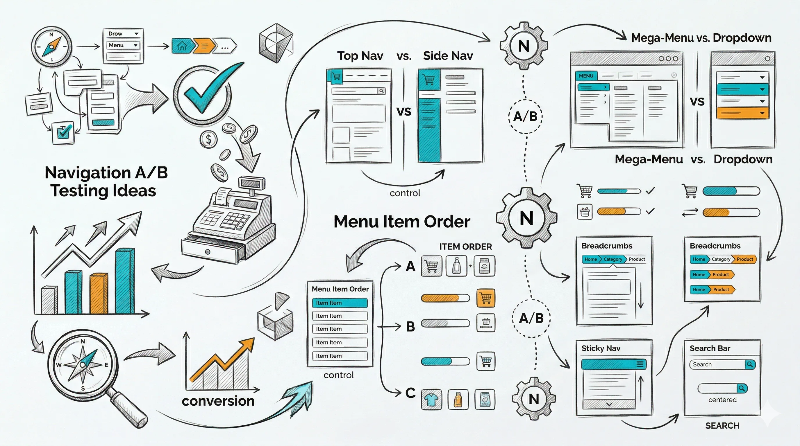
Variant A: Simple dropdown with text links only Variant B: Mega menu showing subcategories + product images + "Best Sellers" preview
Mega menus help shoppers preview category content without clicking. They reduce "I don't know what's in this category" uncertainty for large catalogues. For stores with fewer than 30 total products, simple dropdowns typically outperform mega menus.
Expected lift: 6–12% category exploration rate for large-catalogue stores.
Variant A: "Sale" or "Offers" as the last navigation item Variant B: "Sale" as the second or third navigation item
For discount-driven traffic, moving "Sale" higher in the navigation significantly increases its click-through rate. For premium brands, keeping it last avoids leading with discounts. Test based on your brand positioning.
Expected lift: 20–40% click-through on the Sale navigation item when moved to a higher position.
Variant A: No "Best Sellers" navigation link Variant B: "Best Sellers" as a top-level navigation category
A "Best Sellers" navigation link provides an instant conversion funnel for indecisive visitors who trust crowd wisdom. It's particularly effective for new visitors who don't know your range.
Expected lift: 10–20% click-through from new visitors; higher CVR from the best-sellers page vs. average category.
Variant A: Standard hamburger menu (≡) in the top left/right corner Variant B: Fixed bottom tab bar: Home | Shop | Search | Cart | Account
Bottom tab bars are more thumb-friendly for one-handed mobile use and keep the most important navigation options permanently visible. They typically increase category exploration on mobile by 15–25%.
Expected lift: 15–25% navigation interaction rate on mobile.
Variant A: Hamburger opens a slide-out drawer from the left Variant B: Hamburger opens a full-screen menu overlay
Full-screen menus can show more categories and subcategories simultaneously, reducing the number of taps needed to navigate. Test for your specific catalogue depth.
Variant A: Search icon in the navigation bar (tap to expand) Variant B: Always-visible search bar at the top of the mobile screen below the navigation bar
An always-visible search bar on mobile significantly increases search usage, especially for Shopify stores with large product catalogues.
Expected lift: 20–35% mobile search usage rate.
Variant A: Text list of categories in mobile menu Variant B: 2x2 icon grid with category images and text in mobile menu
Visual category grids help shoppers quickly identify the right category, especially in multi-category stores. Images in the mobile menu reduce cognitive load and increase click-through.
Variant A: Standard category list in mobile menu Variant B: "Continue Browsing — You last looked at [Product Name]" section at the top of the mobile menu for returning visitors
Surfacing recently viewed products in the mobile menu creates a convenient "pick up where you left off" experience for returning visitors and lifts re-engagement rates.
Expected lift: 10–18% returning visitor session depth and product re-engagement.
Variant A: Navigation bar that scrolls out of view as visitor scrolls down Variant B: Navigation bar that sticks to the top of the screen as visitor scrolls
Sticky navigation reduces the effort of switching categories and navigating while mid-page. It typically reduces bounce rate by 3–6% and increases pages per session by 8–12%.
The announcement bar (typically above the navigation) is prime real estate. Test:
Specific, benefit-led announcement bar copy outperforms generic shipping messages. Test which offer has the highest conversion impact for your traffic.
Expected lift: 3–8% click-through from announcement bar to relevant pages.
Variant A: Cart icon shows only item count (3) Variant B: Hovering over cart icon shows a mini cart preview with product thumbnails and total
A mini cart preview on hover (desktop) or tab (mobile) gives customers confidence in what they've added and provides a quick path to checkout, reducing the round-trip to the cart page for review-and-proceed behaviour.
Expected lift: 5–10% checkout initiation rate from mini-cart engagement.
Variant A: No breadcrumb on product pages Variant B: Full breadcrumb path: Home > Skincare > Serums > Vitamin C Serum
Breadcrumbs help visitors understand where they are in the store hierarchy and provide an easy path back to the category without using the browser back button. They reduce product page bounce rate by 3–7%.
Expected lift: 3–7% product page engagement and category re-entry rate.
Variant A: Search that requires full query entry before showing results Variant B: Predictive search that shows matching products, categories, and popular searches as the visitor types
Predictive search reduces search effort significantly and surfaces products before the customer has formulated their full query. It typically lifts search-to-product-page conversion by 20–30%.
Expected lift: 20–30% search-to-product-page conversion rate.
| Test | Area | Expected Lift | Priority |
|---|---|---|---|
| Visible search bar | Primary nav | 8–15% site-wide CVR | High |
| Bottom tab bar (mobile) | Mobile nav | 15–25% mobile nav rate | High |
| Best Sellers link | Primary nav | 10–20% new visitor CTR | High |
| Sticky navigation | Global | 3–6% bounce reduction | Medium |
| Predictive search | Search | 20–30% search CVR | High |
| Announcement bar copy | Utility | 3–8% CTR | Medium |
| Use-case category structure | Primary nav | 8–15% CTR | Medium |
| Mega menu | Primary nav | 6–12% exploration (large cats) | Low–Medium |
Don't test navigation during unusual traffic periods. Navigation tests affect every visitor, so traffic quality matters enormously. Run tests during normal traffic periods and avoid festive season launch days where traffic mix is abnormal.
Segment by new vs. returning visitors. New visitors need discovery navigation (Best Sellers, Use Cases, Search prominent). Returning visitors need efficiency navigation (Recently Viewed, Account access, reorder shortcuts). These audiences benefit from different navigation experiences.
Track downstream, not just navigation clicks. A navigation test that increases category click-through but sends visitors to wrong products is a net loss. Always measure the full path: navigation → category → product → add-to-cart → purchase.
Mobile navigation is its own test stream. Desktop and mobile navigation need to be tested separately. A mega menu that wins on desktop is irrelevant on mobile. Always segment results by device type.
See also: homepage A/B testing ideas and collection page A/B testing ideas for adjacent tests that interact with navigation.