From the conversion glossary
Concepts referenced in this article, defined.
Concepts referenced in this article, defined.
Run rigorous A/B tests and personalize every visit on Shopify or any storefront — no engineers required.
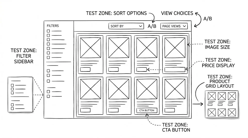
The collection page is the discovery layer of your store. A visitor who lands on your "Skincare" or "Summer Collection" page needs to find the right product quickly — or they'll leave. Collection page optimisation is less about convincing visitors to buy and more about routing them to the product that will convince them. These 20 A/B test ideas address every element of the collection page experience: layout, filtering, sorting, and product card design.
Most D2C brands spend their testing budget on product pages and checkout. Collection pages are often treated as static catalogues. This is a mistake. A collection page with poor filtering, wrong sort order, or cluttered product cards creates decision paralysis — and decision paralysis leads to abandonment. Split testing collection pages is one of the highest-leverage opportunities in ecommerce optimisation because improvements here lift all downstream product page and purchase metrics proportionally.
The primary metric for collection page tests is product page click-through rate — not conversion rate directly. A collection page's job is to route visitors to the right product. Measure that routing efficiency first.
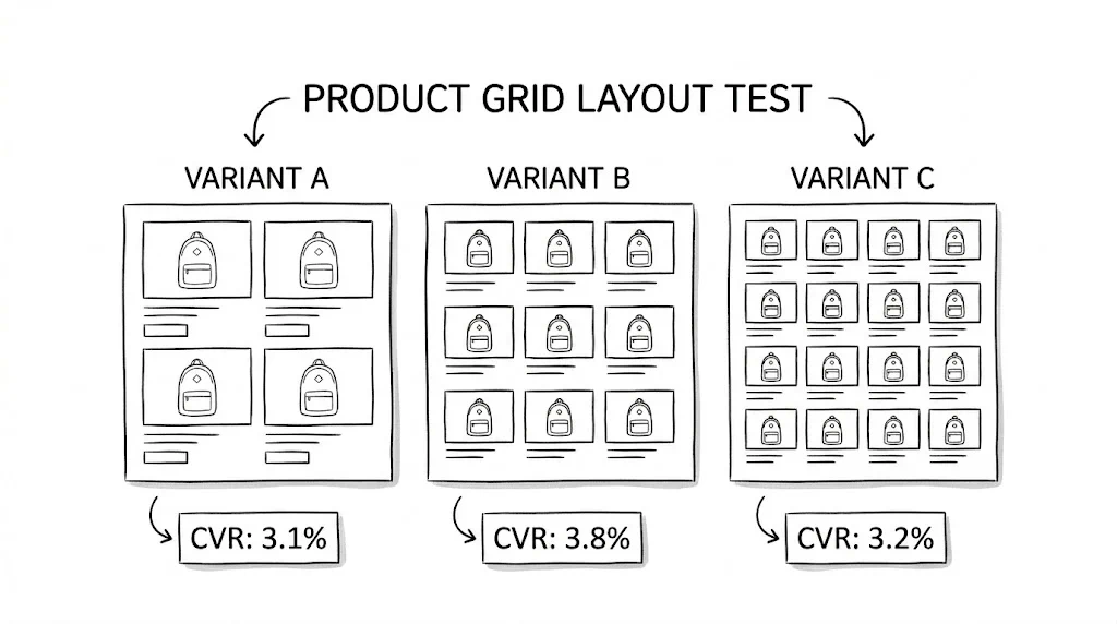
Variant A: 3-column grid on mobile (standard Shopify default) Variant B: 2-column grid on mobile with larger images
Larger images in a 2-column grid show product details more clearly on small screens. For visual categories (fashion, beauty, homewares), 2-column grids typically lift click-through by 8–12%.
Best for: Fashion, beauty, jewellery, lifestyle categories. Expected lift: 8–12% product page click-through rate.
Variant A: Product card with image, title, and price only Variant B: Product card with image, title, price, star rating, and a one-line benefit statement
Adding a star rating and brief benefit statement to product cards reduces the need to click through to evaluate a product — but for the right buyers (those who need quick validation), it increases click-through by confirming quality at a glance.
Expected lift: 5–10% click-through on cards with ratings.
Variant A: Hover shows secondary product image (on-model vs. packshot) Variant B: Hover shows "Quick View" button
Secondary image hover converts better for fashion (shows how it looks worn). Quick View converts better for product detail-heavy categories (supplements, electronics).
Variant A: No add-to-cart on collection cards (click-through only) Variant B: A "+" or "Add to Cart" button on each product card for one-variant products
Quick-add buttons reduce the number of steps for impulse-eligible products. Best for single-variant products (standard size supplements, books, accessories).
Expected lift: 5–15% add-to-cart rate for single-variant impulse products.
Infinite scroll increases page depth but can reduce conversion (visitors scroll past the best products). "Load More" with a fixed initial grid (12–16 products) converts best for most ecommerce stores. Test your specific audience.
Variant A: Large editorial hero banner at the top of the collection page Variant B: Filters visible immediately, no banner, products start above the fold
Filter-first layouts convert better for high-intent shoppers (know what they want). Editorial banners perform better for discovery and inspiration browsing. Segment by traffic source to find which your audience prefers.
Variant A: "Featured" (merchant curated) Variant B: "Best Sellers" (highest sales volume) Variant C: "Newest Arrivals"
Best Sellers as default typically lifts overall collection page CVR by 8–15% because it surfaces your most proven products to the most visitors. New Arrivals works better for loyal returning customers.
Expected lift: 8–15% collection page CVR.
Variant A: Left sidebar with filters (standard) Variant B: Horizontal filter bar above the product grid
Horizontal filter bars take less vertical space and are more mobile-friendly. On mobile, a horizontal filter bar that slides horizontally (pill-style) consistently outperforms a sidebar that requires a separate filter drawer.
Expected lift: 5–10% filter usage rate; 4–8% click-through improvement.
Variant A: Filters by feature: "Ingredient: Vitamin C | Retinol | Niacinamide" Variant B: Filters by outcome: "Goal: Brightening | Anti-Ageing | Acne Control"
Outcome-based filters work better for buyers who know their problem but not their preferred solution. Feature-based filters work better for knowledgeable buyers who know what ingredient they want.

Variant A: All filter categories expanded and visible Variant B: Top 3 filters expanded, rest collapsed behind "More Filters"
Showing all filters creates visual clutter. Showing the 3 most-used filters with a "More" option reduces overwhelm while keeping the most useful navigation accessible.
Variant A: Applied filters shown only in the filter sidebar Variant B: Applied filters shown as removable chips above the product grid
Active filter chips above the grid remind visitors what they've filtered for and make it easy to adjust — reducing filter abandonment.
Expected lift: 3–7% filter retention and 5–8% click-through improvement.
Variant A: "No results found" with empty page Variant B: "No results — but you might like these" with 8 relevant product recommendations
A graceful fallback with recommendations keeps visitors on-site when their specific filter combination has no matches. Critical for preventing abandonment from over-filtering.
Variant A: "₹799" with strikethrough "₹999" Variant B: "₹799 (20% off)" Variant C: "Save ₹200"
"Save ₹200" (absolute saving) outperforms percentage for smaller discounts. Percentage format outperforms for discounts above 25%. Test which format works for your specific price point.
Variant A: No ribbons on product cards Variant B: Ribbons on top 5 bestsellers ("Best Seller"), newest arrivals ("New"), and limited-stock items ("Low Stock")
Status ribbons direct attention toward products you want to move. "Best Seller" ribbon increases click-through on ribboned products by 15–20%.
Variant A: No reviews on cards (click-through to product page for reviews) Variant B: Star rating + review count on each card
Star ratings on cards reduce uncertainty before the click and increase click-through for products with strong review profiles. Products with <10 reviews should not show ratings on cards (low count reduces trust).
Variant A: No colour swatches on cards (colour visible on product page) Variant B: Available colour swatches directly on product card, clickable to change the displayed image
Colour swatches on cards significantly lift engagement for fashion and beauty products — buyers can see their preferred colour option before clicking through, reducing disappointed bounce from the product page.
Variant A: Standard price and review info on cards Variant B: Add "Loved by 2,400+ customers" below the product title on top products
Social proof numbers on product cards convert better than star ratings alone for categories where community validation matters (supplements, skincare, fitness).
Variant A: Standard collection page for all visitors Variant B: A personalised row at the top of the collection page for returning visitors showing products based on previous browse/purchase history
Personalised rows at the top of collection pages lift click-through by 12–20% for returning visitors who have browsing history.
Variant A: Standard category navigation on collection page Variant B: Add "Shop by Goal" tabs at the top of the collection page: "For Dry Skin | For Oily Skin | Anti-Ageing | Brightening"
Goal-based filter tabs on collection pages route new visitors to relevant products faster and lift product page click-through by 10–18% for buyers who shop by problem, not by product type.
Variant A: Browse standard collection grid Variant B: "Not sure where to start? Answer 3 questions → Get your personalised picks"
A short quiz on the collection page that routes new visitors to 3–5 recommended products based on their answers. Reduces browse paralysis for new visitors and lifts product page click-through by 15–25% for quiz-completing visitors.
| Test | Area | Expected Lift | Priority |
|---|---|---|---|
| 2-column mobile grid | Layout | 8–12% CTR | High |
| Default sort to Best Sellers | Sort | 8–15% CVR | High |
| Horizontal filter bar | Filter | 5–10% usage | High |
| Outcome-based filter labels | Filter | Qualitative | Medium |
| "Best Seller" ribbon | Cards | 15–20% CTR on ribboned | High |
| Colour swatches on cards | Cards | Significant (fashion) | Medium |
| Personalised row for returners | Personalisation | 12–20% CTR | Medium |
| Quiz on collection page | Discovery | 15–25% CTR (quiz users) | Medium |
Track click-through rate as your primary metric. Collection pages are discovery pages. Their job is to send visitors to the right product page. CVR on the collection page itself is a less meaningful metric than the downstream product page visit rate.
Segment by new vs. returning visitors. Returning visitors know your range. New visitors don't. These two audiences need different default sort orders, filter prominence levels, and discovery options. CustomFit.ai's audience segmentation handles this automatically.
Don't over-filter your own collection. Tests that add too many filters can actually reduce discovery by making the page feel like work. Stick to the 5–7 most-used filter dimensions and test ruthlessly to find the optimal filter set.
See also: product page A/B testing ideas and navigation A/B testing ideas for complementary tests.