From the conversion glossary
Concepts referenced in this article, defined.
Concepts referenced in this article, defined.
Run rigorous A/B tests and personalize every visit on Shopify or any storefront — no engineers required.
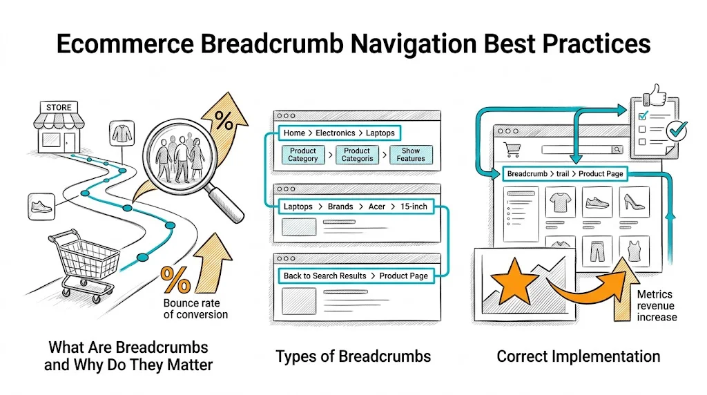
Breadcrumb navigation is a small UI element with outsized impact on both user experience and SEO. A shopper who lands on a product page via Google has no context of where they are in your site. Breadcrumbs answer this instantly—and give them a one-click path to browse related products in the same category. Implemented correctly, breadcrumbs reduce bounce rates, improve page depth, and earn rich snippets in search results that increase organic click-through rates.
Breadcrumbs are a trail of links showing the hierarchical path from homepage to the current page:
Home > Skincare > Moisturizers > Vitamin C Glow Moisturizer 50ml
Each segment is a clickable link. The current page (last segment) is typically non-clickable text or a muted color.
User experience benefit: Shoppers who land on a product page from an ad, email, or Google do not know where they are in your catalog. Breadcrumbs answer "where am I?" and "what else is here?" in two seconds. The result is more category page exploration—and more opportunities for conversion.
SEO benefit: Breadcrumbs with BreadcrumbList schema markup appear in Google search results as:
customfit.ai › blog › Skincare › Moisturizers
This rich snippet format improves visibility and click-through rate compared to a plain URL display.
Bounce rate benefit: A shopper who did not find exactly what they wanted on the product page they landed on can click the parent breadcrumb ("Moisturizers") to continue browsing. Without breadcrumbs, many of these shoppers bounce instead.
Hierarchy-based breadcrumbs (most common): Show the category path—Home > Category > Subcategory > Product. Best for brands with clear category structures.
History-based breadcrumbs: Show the user's navigation path—pages they actually visited. Problematic because they change with each user journey and create inconsistent page states. Avoid for ecommerce.
Attribute-based breadcrumbs: Show filtered navigation—Home > Women's Kurtas > Cotton > Blue. Useful for heavily filtered browsing but complex to implement.
For most D2C brands, hierarchy-based breadcrumbs on category and product pages are the right choice.
Breadcrumbs should be implemented as <nav> elements with an aria-label="Breadcrumb" attribute for accessibility. Individual items should use <ol> (ordered list) since the hierarchy order matters.
<nav aria-label="Breadcrumb">
  <ol>
    <li><a href="/">Home</a></li>
    <li><a href="/collections/skincare">Skincare</a></li>
    <li><a href="/collections/moisturizers">Moisturizers</a></li>
    <li aria-current="page">Vitamin C Glow Moisturizer</li>
  </ol>
</nav>
The aria-current="page" attribute tells screen readers this is the current page.
Add BreadcrumbList schema to your product page <head> or as a JSON-LD script:
{
  "@context": "https://schema.org",
  "@type": "BreadcrumbList",
  "itemListElement": [
    {
      "@type": "ListItem",
      "position": 1,
      "name": "Home",
      "item": "https://yourbrand.com/"
    },
    {
      "@type": "ListItem",
      "position": 2,
      "name": "Skincare",
      "item": "https://yourbrand.com/collections/skincare"
    },
    {
      "@type": "ListItem",
      "position": 3,
      "name": "Moisturizers",
      "item": "https://yourbrand.com/collections/moisturizers"
    },
    {
      "@type": "ListItem",
      "position": 4,
      "name": "Vitamin C Glow Moisturizer"
    }
  ]
}
Most Shopify themes include this automatically, but verify using Google's Rich Results Test that schema is being output correctly.
Placement: Just below the header, above the page title. This is where users look for navigation context.
Separator: Use > or / between segments. Avoid decorative separators that may not render correctly across screen sizes.
Typography: Breadcrumb text should be smaller than body text (12–13px) but readable. Use a muted color (not bold) to indicate secondary importance relative to the main page content.
Current page: The current page segment can be non-linked text, slightly bolder, or a distinct color to indicate "you are here."
Link hover state: All linked breadcrumb segments should have a visible hover state to communicate interactivity.
Full breadcrumb chains on mobile screens (320–375px wide) become cramped and hard to tap:
Option 1: Abbreviate to parent only. Show only "< Moisturizers" as a back link. Simple, functional, takes minimal space.
Option 2: Horizontal scroll. Allow the breadcrumb row to scroll horizontally rather than wrapping. The current page is always visible; earlier segments require a swipe.
Option 3: Ellipsis collapse. Show "Home > ... > Moisturizers > Current Page" with the intermediate levels collapsed under an ellipsis.
Option 1 (parent-only back link) is the most common and user-friendly approach for mobile. It sacrifices the full hierarchy for usability—a good tradeoff on small screens.
Many products appear in multiple collections: a vitamin C serum might be in "Skincare," "Serums," "Vitamin C Products," and "Gift Sets." This creates a breadcrumb ambiguity—which category path does the breadcrumb show?
Best practice: Define one canonical category path per product. The canonical path is typically the most specific primary category the product belongs to (e.g., "Skincare > Serums > Vitamin C Serum," not "Gift Sets > Skincare Gifts > Vitamin C Serum").
Set the canonical URL for the product to the primary category path URL and use that path in the breadcrumb. This prevents duplicate content issues and creates consistent, logical breadcrumbs.
In Shopify, the default product URL (/products/product-name) is the canonical; breadcrumb paths can reference the collection the product was accessed from. Use your theme settings or a breadcrumb app to configure canonical path behavior.
Product pages: Essential. This is where users most need location context after landing from external sources.
Collection/category pages: Recommended for subcategories (Home > Skincare > Moisturizers). Optional for top-level categories where "Home > Skincare" adds little context.
Blog posts: Recommended (Home > Blog > Category > Post Title) for context and SEO.
Checkout pages: Do not show breadcrumbs in checkout. The checkout flow should be linear and distraction-free.
Homepage: Never show breadcrumbs on the homepage—there is nothing to navigate up to.
Related reading: Conversion Rate Optimization | Product Page | Shopping Experience | Ecommerce Site Search | Ecommerce Filter & Sort
See also: D2C & Ecommerce Growth Pillar