From the conversion glossary
Concepts referenced in this article, defined.
Concepts referenced in this article, defined.
Run rigorous A/B tests and personalize every visit on Shopify or any storefront — no engineers required.
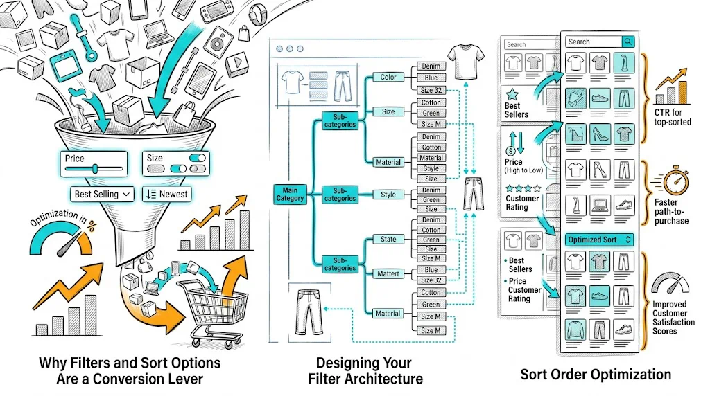
Collection pages are where browsing shoppers decide what to explore and where high-intent shoppers confirm their choice. Filters and sort options are the primary tools shoppers use to navigate from a 50-product collection to the 3–5 products they actually want to consider. Get this UX right and you reduce time-to-decision; get it wrong and shoppers leave without finding what they were looking for—even when you have exactly the product they want.
The path from landing on a collection page to adding a product to cart involves:
Filters and sort tools power Step 2. If Step 2 fails—filters are too broad, too narrow, or missing the relevant attribute—shoppers either wade through irrelevant products (time-consuming, conversion-negative) or give up entirely.
Ecommerce research consistently shows that shoppers who use filters have 40–60% higher add-to-cart rates than those who do not. The filter experience is a conversion experience.
The worst filter UX is a one-size-fits-all filter panel with 15 attributes, most of which are irrelevant to the current category. A skincare buyer does not need to filter by "fabric type." A fashion buyer does not need to filter by "skin type."
Build filter sets specific to each collection:
Shopify's native filtering uses product tags, variant options, and metafields. Most filter apps allow custom filter sets per collection.
Decision paralysis is real. A filter panel with 12 attribute categories overwhelms shoppers. Research shows that optimal filter count is 4–6 main filter attributes per category, with individual options collapsible.
Within each filter attribute, show the 5–7 most commonly used options first with a "Show more" option. For color filters, 6–8 colors visible before "Show 12 more" is a better UX than all 20 colors displayed simultaneously.
Shoppers do not always want exactly one option. A shopper looking for moisturizers suitable for "oily or combination" skin needs to be able to select both. Multi-select filters are strongly preferred over radio buttons that allow only one selection per attribute.
As a shopper applies filters, showing "12 products" or updating the count in a button ("See 12 results") dramatically improves filter UX. It prevents the "I applied too many filters and got 0 results" dead end by letting shoppers see the impact of each filter before committing.
The default sort order (what shoppers see before they change anything) is your highest-impact choice:
Best Selling: Leverages social proof—the products most other people have bought rank first. Works well for trust-building and reduces decision anxiety for new visitors.
Recommended/Featured: A manually curated or algorithmically personalized order. Works best when you have strong data on what converts for each visitor segment. CustomFit.ai enables personalized product ranking on collection pages without custom development.
Newest First: Works for fashion, trends, and categories where recency is a quality signal. Use for "New Arrivals" collections.
Price Low to High / High to Low: Self-selected by shoppers who are price-conscious or luxury-seeking. Rarely a good default but essential as an option.
Test your default sort with A/B testing. The difference between "Best Selling" and "Featured" can be 10–20% in add-to-cart rate for the same collection.
Label sort options clearly:
Match the language your customers use. If your user research or search queries show customers use "top rated," consider that as a sort label over "Average Rating."
Mobile shoppers use filters differently from desktop. Best practices for mobile:
Filters in a slide-in drawer, not a side panel. A full-width drawer that slides in from the left or bottom is more usable on mobile than a collapsible side panel.
"Filter" and "Sort" as separate prominent buttons near the top of the collection page—not buried in a dropdown. Visible controls increase filter usage.
Sticky filter bar: On mobile, a filter/sort bar that sticks to the top of the viewport as the user scrolls allows filtering without returning to the top of the page.
Large tap targets for filter options: Checkboxes with small tap targets lead to mis-selections on mobile. Minimum 44×44px tap targets for each filter option.
Apply button, not auto-apply: On mobile, auto-applying filters on every selection is jarring. Let shoppers select multiple options, then tap "Apply Filters" to see results.
When shoppers have active filters applied, show them clearly:
Hidden active filters (shoppers forget they have filters applied and wonder why results seem narrow) are a common usability failure. Make active filter state impossible to miss.
Filter combinations can generate thousands of crawlable URLs: /collections/skincare?filter.p.tag=oily&filter.p.tag=acne&sort_by=price-ascending. If search engines crawl these, you risk:
Solutions:
rel="canonical" to the base collection URL on all filter parameter URLsnoindex on paginated filter result pagesRelated reading: Conversion Rate Optimization | Product Page | Cart Abandonment | Ecommerce Site Search | Ecommerce Breadcrumb Navigation
See also: D2C & Ecommerce Growth Pillar