From the conversion glossary
Concepts referenced in this article, defined.
Concepts referenced in this article, defined.
Run rigorous A/B tests and personalize every visit on Shopify or any storefront — no engineers required.
A/B testing your navigation menu means running controlled experiments on how you label, organize, and present your site's primary and secondary navigation — and measuring whether changes improve how efficiently users find products and convert. Navigation directly affects every page on your site, so a winning variant compounds across your entire funnel. For D2C ecommerce brands on Shopify, the most impactful navigation tests focus on category labels, menu depth, and mobile navigation patterns.
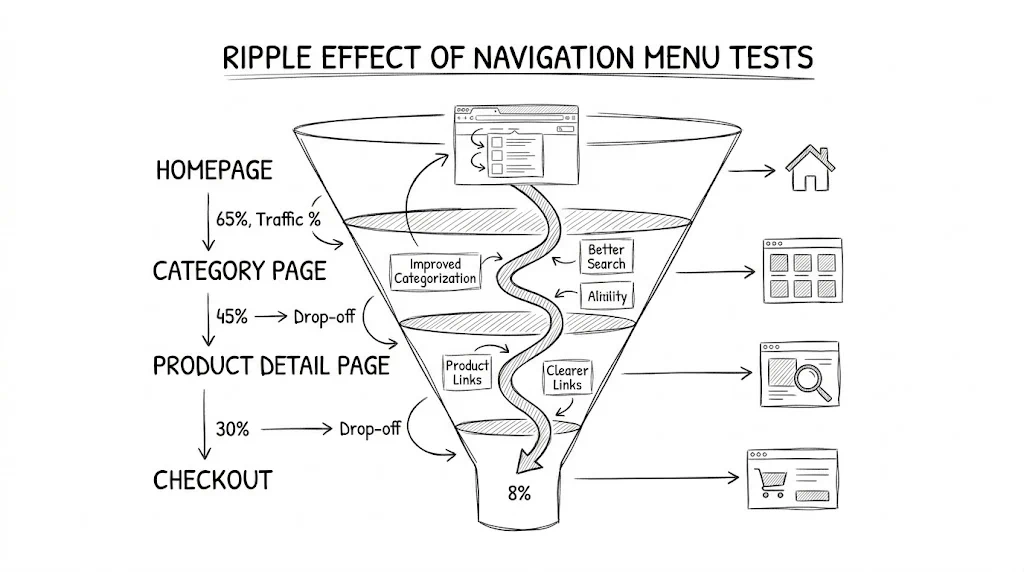
Navigation is the skeleton of your site. Unlike a product page CTA test that only affects visitors to that page, a navigation change affects every session that starts anywhere on your store. Bellavita improved their overall conversion rate by 11% through a series of UX changes — navigation clarity was a key component, as it determined whether visitors could find the right product category before abandoning.
The challenge with navigation testing is that the effect is indirect. A visitor doesn't convert at the nav bar — they convert at checkout. That means your test metric must be downstream (conversion rate, AOV, revenue per visitor), which requires more traffic and longer test durations than direct-impact tests.
The words you use in your navigation determine whether visitors recognize which section contains what they're looking for.
Test ideas:
For brands like Kapiva or Mamaearth targeting health-conscious Indian buyers, testing whether "Immunity" or "Wellness" or "Ayurvedic" performs better as a category label can have real impact on category page reach rates.
Flat vs. hierarchical navigation:
Indian D2C stores often carry wide assortments. A kurta brand may have: Women → Kurtas → Cotton Kurtas → Printed Cotton Kurtas. Test whether collapsing two levels ("Women's Kurtas" as top-level) increases CTR vs. the granular tree.
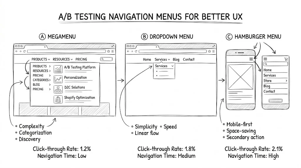
Mega menu vs. simple dropdown:
Test mega menus on desktop when you have 10+ categories. Mega menus with product images have been shown to improve click-through to category pages by 15-20% in retail contexts — but they also add visual complexity.
People read menus left-to-right and top-to-bottom. The first item gets disproportionate attention.
Test ideas:
Mobile accounts for 70-80% of Indian ecommerce traffic. Navigation tests on mobile have proportionally larger impact.
Test ideas:
See also A/B testing banners for ecommerce for how top-of-page elements interact with navigation.
Step 1: Define your hypothesis "Changing the primary navigation from 5 generic categories to 7 specific product-type categories will increase category page reach rate by 10% and overall CVR by 5%."
Step 2: Choose your primary metric Since navigation affects the whole funnel, use one of:
Avoid bounce rate as your sole metric — it doesn't distinguish between "left immediately" and "found what they wanted immediately."
Step 3: Calculate sample size Navigation tests need large samples. Use the sample size formula with your overall site CVR as the baseline. At a 3% CVR and detecting a 10% relative lift at 95% confidence level, you need ~15,000 visitors per variant.
Step 4: Run for a full business cycle Navigation tests must capture the full weekly pattern. Indian consumers browse heavily on weekends and shop during weekday evenings. Run for at least 2 full weeks, ideally 4.
Step 5: Segment your analysis
Testing navigation and content simultaneously — If you change the nav labels and the homepage hero at the same time, you can't attribute results to either change. Test one thing at a time.
Using CTR on the nav as your success metric — Just because more people click a nav item doesn't mean they convert. A poorly labeled category might get fewer clicks from the right people and more clicks from the wrong people.
Running for too short a period — Navigation tests on lower-traffic sites often need 6-8 weeks for statistical significance. Cutting tests short introduces peeking errors.
Ignoring mobile and desktop separately — A navigation change that wins on desktop may lose on mobile if the component renders differently. Always segment by device.
Related reading: A/B Testing Pillar | A/B Testing Banners for Ecommerce | Session Recording Analysis | Conversion Rate