From the conversion glossary
Concepts referenced in this article, defined.
Concepts referenced in this article, defined.
Run rigorous A/B tests and personalize every visit on Shopify or any storefront — no engineers required.
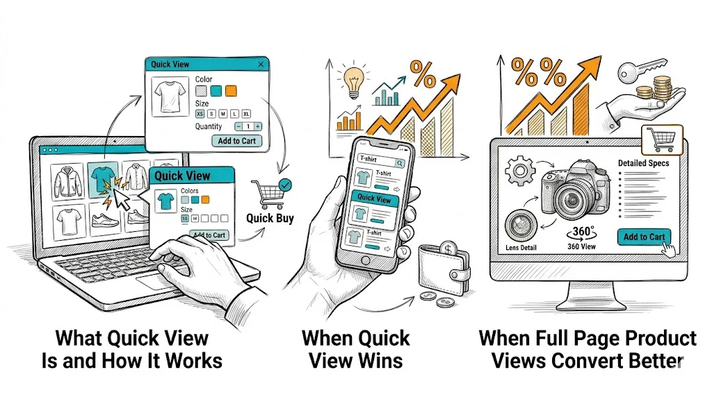
The quick view debate has no universal answer—and that is the right starting point for this guide. Quick view (a product modal overlaying the collection page) has genuine value for some products and shoppers; for others, it is a conversion barrier dressed up as a convenience feature. Understanding when each approach wins helps you make the right decision for your catalog rather than copying what larger stores do.
Quick view is a UI pattern on collection pages where clicking a product (or a "Quick View" button on hover) opens an overlay modal with:
The shopper can add the product to cart without navigating to the full product page. When they close the modal, they are back where they were on the collection page—browse flow uninterrupted.
The proposed benefit: faster browsing, less friction for decisive shoppers, higher add-to-cart rate on collection pages.
The risk: quick view provides less information than the full product page. For shoppers who need reviews, detailed descriptions, size guides, or ingredient lists to purchase with confidence, quick view truncates the information they need—and produces lower-quality adds-to-cart that abandon at checkout or result in returns.
For a shopper reordering their regular face wash or vitamin supplement, the full product page adds friction, not value. They already know the product. A quick view that shows the variant they want and an add-to-cart button is all they need.
Categories where quick view tends to perform well:
Shoppers in browse mode—not looking for a specific product but exploring a sale or curated collection—use quick view as a triage tool: "Is this interesting enough to explore further?" If the quick view is compelling, they click "View Full Product" to go deeper. If it is not, they close and continue browsing.
In this mode, quick view acts as a progressive disclosure mechanism—a first filter before the full product page.
On mobile, product grids with small thumbnails make it hard to evaluate products without tapping into each one. A quick view triggered by tapping a product image (with "View Full Details" as a secondary link) can reduce the tap-load cycle for decisive shoppers. However, mobile modal UX is tricky—see the implementation section below.
For fashion, furniture, electronics, and premium beauty or health products, the purchase decision involves:
A quick view modal cannot contain all of this effectively. Truncated information leads to lower-quality purchase decisions—customers add to cart with uncertainty and abandon at checkout or initiate returns after delivery.
For any product where the full product page is doing real conversion work (reviews, videos, detailed specs), sending shoppers to the full page is the right call.
A kurta with 5 sizes, 8 colors, and 3 length options in a quick view modal creates a cramped, stressful variant selection experience. The full product page has space to show color swatches clearly, display size guides inline, and show variant-specific stock indicators. Quick view compresses this into a small modal—a poor experience for complex variant products.
Full product page visits generate clean analytics data: which products are viewed, how long shoppers engage, where they drop off. Quick view bypasses product page visits, making it harder to track individual product performance. It also means search engines may not see the product page visited as part of the session journey—though this does not directly affect crawling.
If your analysis suggests quick view is right for your catalog:
Image quality must match the full product page. A quick view with low-resolution or poorly cropped images creates a worse impression than the full page. Use the same hero image and at least 2–3 gallery images in the modal.
Variant selection must be clear. Size, color, and quantity selectors need sufficient space and clear current-selection states. If variant options exceed what fits cleanly in the modal, the quick view is failing.
Always include a "View Full Details" link. The quick view should not be a dead end—shoppers who want more information should have a one-click path to the full product page. Position this link near the add-to-cart button, not buried at the bottom.
Mobile quick view is often a worse experience. On small screens, modals are cramped and the "tap outside to close" behavior is inconsistent. Consider showing quick view on desktop only and using a standard collection-to-product navigation on mobile.
Loading speed matters. A quick view modal that takes 2+ seconds to load is worse than just navigating to the product page. If your product images are large and your quick view app loads slowly, skip it.
The only reliable way to know whether quick view improves your store's performance is to test it. Run a clean A/B test:
Measure:
Use CustomFit.ai to set up this test without developer involvement. Run it for at least 2 weeks with enough traffic to reach statistical significance before deciding.
Important: do not measure only add-to-cart rate. Quick view often increases collection page adds to cart while decreasing the quality of those adds—resulting in no improvement or worse performance at checkout.
Related reading: Conversion Rate Optimization | Product Page | Cart Abandonment | A/B Testing | Ecommerce Filter & Sort
See also: D2C & Ecommerce Growth Pillar