CustomFit.ai โ€” Website personalization, A/B testing and CRO for Shopify and D2C
Product
Features
โœฑ
Website Personalization
Adapt to each visitor's behavior & intent
โง–
A/B & Multivariate Testing
Rigorous experimentation
โœจ
AI CopilotNEW
Personalize with a prompt
๐Ÿค–
AI WingmanNEW
Auto-optimize toward winners
๐ŸŽฏ
AI Conversion OptimizerNEW
GPT-grade test ideas
โœŽ
No-Code Visual Editor
Drag-and-drop edit any element
โ–ฆ
Product Recommendations
Personalized recs that lift AOV
โš‘
Feature Flags
Ship safely with kill-switches
โ—ง
Chrome Extension
Edit your store in the browser
โง‰
Shopify, WooCommerce & more
All platform integrations
View all features โ†’
Use Cases
$
Price A/B Testing
Test price points to maximize revenue
โ–ฆ
Theme A/B Testing
Compare whole layouts & designs
๐Ÿ—‚
Template A/B Testing
Test whole PDP/PLP templates
๐Ÿท
Discount A/B Testing
Find the offer that converts
๐Ÿšš
Shipping A/B Testing
Thresholds, speed & copy
โœ
Content A/B Testing
Copy, images & reviews
๐Ÿ’ณ
Checkout Gateway A/B
Payments & one-click
โŒ–
Geo-Based Personalization
Per-location content & offers
โšก
Buyer-Intent Nudges
Exit-intent & retargeting
โ†”
Split-URL / Redirection
Full-page redirect tests
View all use cases โ†’
Solutions & Guides
โคข
Conversion Rate Optimization
The complete CRO guide
โง–
A/B Testing Software
Buyer's guide for D2C
๐Ÿ›’
Cart Abandonment Recovery
Win back lost carts
๐Ÿ“ฐ
Landing Page Optimization
Convert more paid traffic
S
Shopify A/B Testing
Test your store, no code
S
Shopify Personalization
Tailor the store per shopper
โ—”
First-Time Visitor Offers
Convert new shoppers with trust & offers
โ˜…
Repeat-Customer Experiences
Reward and re-engage loyal buyers
โ—Ž
Campaign-Matched Pages
Match the landing page to the ad
โŒ–
Location-Based Experiences
Currency, language & regional offers
Explore CRO โ†’
Customer stories
GIVA
+32%
conversion via personalized recs
GIVA
Mamaearth
+18%
revenue lift from PDP A/B tests
ME
The Sleep Company
+24%
AOV from product recommendations
TSC
Read customer stories โ†’
Integrations
SWsfGA+15
โœฆ
Not sure where to start?
Let AI Copilot pick your first tests

โ€œWe wake up to evidence-backed tests ready to deploy โ€” not a backlog of maybe ideas.โ€

AN
Anirudh S.
Growth ยท Chargebee
โ˜…โ˜…โ˜…โ˜…โ˜…4.8on G2 ยท 2,400+ brands
Talk to our team โ†’
Widgets
Integrations
Ecommerce & Checkout
Shopify
Shopline
Shoplazza
GoKwik
ShopFlo
Razorpay Magic Checkout
Breeze
Shiprocket
View all integrations โ†’
Analytics & Behavior
Google Analytics 4
Microsoft Clarity
Hotjar
Mixpanel
Amplitude
Heap
Adobe Analytics
Segment (CDP)
View all integrations โ†’
Engagement, CRM & More
Klaviyo
MoEngage
CleverTap
WebEngage
HubSpot
Salesforce
Slack
Meta Ads
View all integrations โ†’
CustomersPricing
Resources
CRO
โ–ค
Playbooks
Proven strategies to boost conversions
๐ŸŽ™
Interviews
D2C leaders & marketing experts
โ–ถ
Webinars
Live deep dives & product sessions
Learn
โœŽ
Blog
Tips, experiments & best practices
๐Ÿ“•
Free E-Books
Mastering personalization
๐Ÿ“–
Conversion Glossary
Every CRO term, defined
โœฆAI CopilotNEWLog inBook a demo
Start free trial
Select your platform โ€” Install in 2 minsWe'll tailor the setup
โšก Risk-free 14-day trial ยท No credit card ยท Cancel anytime
S
Shopify
Install from Shopify App Store
โ€บ
W
WooCommerce
Install the WooCommerce plugin
โ€บ
B
BigCommerce
Install from BigCommerce App Marketplace
โ€บ
SL
Shopline
Install from Shopline App Store
โ€บ
M
Salesforce / Magento
Install from the marketplace
โ€บ
SZ
Shoplazza
Install from Shoplazza App Store
โ€บ
WP
WordPress / Webflow
Install plugin or paste the script
โ€บ
โ—ง
Others
Custom-built on React, Next.js, etc.
โ€บ
Tip: pick your platform โ€” we handle the restBook a demo โ†’
Product
Website PersonalizationA/B & Multivariate TestingAI CopilotAI WingmanAI Conversion OptimizerNo-Code Visual EditorProduct RecommendationsFeature FlagsView all features โ†’
Use Cases
Price A/B TestingTheme A/B TestingTemplate A/B TestingDiscount A/B TestingShipping A/B TestingContent A/B TestingCheckout Gateway A/BGeo-Based PersonalizationBuyer-Intent NudgesSplit-URL / Redirection
Solutions & Guides
Conversion Rate OptimizationA/B Testing SoftwareCart Abandonment RecoveryLanding Page OptimizationShopify A/B TestingShopify Personalization
Explore
WidgetsIntegrationsCustomersPricing
Resources
BlogPlaybooksWebinarsInterviewsE-BooksConversion Glossary
Platforms
ShopifyShoplineShoplazzaChrome ExtensionAll integrations
Start free trialBook a demo
Homeโ€บBlogโ€บproduct pageโ€บProduct Comparison Tables: Design & A/B Test

Product Comparison Tables: Design & A/B Test

AKAshwin KumarCo-Founder & CEO, CustomFit.aiJanuary 15, 20258 min read
On this page
  1. When Comparison Tables Are Most Useful
  2. Core Design Principles for Comparison Tables
  3. 1. Lead with Buyer Outcomes, Not Product Features
  4. 2. Limit to 5โ€“7 Rows
  5. 3. Highlight the Recommended Option
  6. 4. Use Visual Differentiators for Key Rows
  7. 5. Mobile-First Layout
  8. Comparison Table Placement: Where to Put It
  9. On the Product Detail Page (PDP)
  10. On Collection and Category Pages
  11. On Dedicated Comparison Landing Pages
  12. A/B Testing Strategies for Comparison Tables
  13. Test 1: Table vs. No Table
  14. Test 2: Recommended Option Labeling
  15. Test 3: Number of Rows
  16. Test 4: Mobile Table Format
  17. Test 5: Highlighted Column Position
  18. Real D2C Examples
  19. Tips and Best Practices
  20. Key Takeaways
0%
Product Comparison Tables: Design & A/B Test

From the conversion glossary

Concepts referenced in this article, defined.

Definition
What Is Variant? Definition, Formula & Guide
Definition
What Is Control? Definition, Formula & Guide
Definition
What Is Social Proof? Definition & Guide
Definition
What Is Collection Page? Definition & Guide
Definition
What Is Lift? Definition, Formula & Guide
โ† Back to Product Page guide
Try CustomFit.ai

Run A/B tests and personalize your store without code. 14-day free trial, no credit card.

Start free trial โ†’
Share
XLinkedInEmail

Related articles

product page

Size Guide Optimization for Fashion Ecommerce

Sapna Joharยท 8 min read
product page

Product Video: How It Impacts Conversion Rates

Ashwin Kumarยท 9 min read
product page

Product Reviews Strategy for Ecommerce

Ashwin Kumarยท 8 min read

Start lifting conversions today.

Run rigorous A/B tests and personalize every visit on Shopify or any storefront โ€” no engineers required.

Start free trialBook a demo

Built for every D2C category

๐Ÿงด
Skincare
๐Ÿ’„
Beauty
๐ŸŒฟ
Wellness
โ˜•
F&B
๐Ÿ‘Ÿ
Apparel
๐Ÿ’
Jewelry
๐Ÿ›‹๏ธ
Home
๐Ÿผ
Baby
Live ยท Right now
Mamaearth โ€” free-shipping band +12.4% AOVGIVA โ€” festive collection page +34% revenueBellavita โ€” PDP CTA test +27.4% CVRKapiva โ€” Quiz-driven recs +9.48% CTRThe Sleep Co โ€” landing personalized 2ร— capturesPlum โ€” Returning shopper swap +18.2% CVRMamaearth โ€” free-shipping band +12.4% AOVGIVA โ€” festive collection page +34% revenueBellavita โ€” PDP CTA test +27.4% CVRKapiva โ€” Quiz-driven recs +9.48% CTRThe Sleep Co โ€” landing personalized 2ร— capturesPlum โ€” Returning shopper swap +18.2% CVR
Get in touch

Tell us about your store.

We reply within an hour during business hours. No sales pitch, no spam โ€” just answers from someone who's seen 2,400+ D2C stores.

โœ“ Reply within 1 hourโœ“ No spam, everโœ“ Free demo & setup help
โœ“ Thanks! We'll be in touch shortly.
CustomFit.ai

The all-in-one website personalization, A/B testing & CRO platform for high-growth D2C brands. Made by marketers, fueled by coffee.

in๐•โ—Žโ–ถf
Product
  • Features
  • A/B Testing
  • Personalization
  • AI Copilot
  • AI Wingman
  • AI Conversion Optimizer
  • Feature Flags
  • Widgets
  • Integrations
  • ROI Calculator
Platforms
  • Shopify
  • Shopline
  • Shoplazza
  • Salesforce
  • Chrome Extension
  • All Integrations
Resources
  • Blog
  • Playbooks
  • Webinars
  • GrowthFit Interviews
  • Free E-Books
  • Conversion Glossary
  • Case Studies
Compare
  • vs VWO
  • vs Optimizely
  • vs Google Optimize
  • vs Mutiny
  • vs Intelligems
  • vs Shoplift
  • vs AB Tasty
  • vs Convert
  • vs Kameleoon
Company
  • About Us
  • Partners
  • CustomFit Awards
  • Recognition
  • Contact
  • Privacy Policy
  • Terms & Conditions
ยฉ 2026 CustomFit.ai ยท Valley Monks Pvt Ltd ยท Made by marketers, fueled by coffee, and obsessed with conversions.
SOC 2 Type II ยท GDPR ยท CCPA ยท ISO 27001

When a buyer is choosing between your protein powder variants, skincare kit sizes, or subscription tiers, they aren't just comparing products โ€” they're trying to make a decision with confidence. Product comparison tables exist to make that decision easier. Done well, they reduce decision fatigue, increase AOV by guiding buyers to higher-value options, and lower drop-off at the variant selection step. Done poorly, they add clutter without clarity. This guide covers how to design, implement, and test comparison tables that actually lift conversion.

When Comparison Tables Are Most Useful

Not every product needs a comparison table. The tactic works best when:

  • You have 3+ variants that differ in meaningful ways (not just color or size, but features, quantity, or formulation)
  • Buyers show hesitation at the variant selection step (high bounce or drop-off at the "choose your size/tier" moment)
  • Your category has complex or technical decision criteria (supplements, skincare regimes, software plans, appliances)
  • AOV optimization is a priority (comparison tables reliably nudge buyers toward mid-to-high-tier options)

For simple products with 2 variants that differ only in size or color, a comparison table adds complexity without benefit. Use it for meaningful differentiation.

Core Design Principles for Comparison Tables

1. Lead with Buyer Outcomes, Not Product Features

Most comparison tables list features. The best ones lead with outcomes โ€” what the buyer gets, not what the product has.

Weak: "25g protein, 5g BCAA, 0g sugar" Strong: "Maximum muscle recovery, zero sugar bloat, 25g of clean protein"

Structure your table rows around the questions buyers are actually asking, not the spec sheet.

2. Limit to 5โ€“7 Rows

More than 7 comparison rows creates overwhelm. Identify the 5โ€“7 attributes that most influence the purchase decision in your category. Leave the rest for the full product description.

For a D2C supplement brand, the critical rows might be:

  • Protein per serving
  • Total servings per pack
  • Flavors available
  • Third-party certification
  • Price per serving
  • Best for (goal/use case)

3. Highlight the Recommended Option

Always highlight one option as "Most Popular," "Best Value," or "Recommended" โ€” this is called a recommendation anchor. It serves two purposes: it reduces decision paralysis and it guides buyers toward the product you want them to choose (typically your best-margin or highest-AOV option).

The highlighted column should have a distinct visual treatment: a colored header, a subtle shadow or border, and a label. The visual hierarchy makes it clear which option most buyers choose โ€” and that social proof is itself a conversion driver.

4. Use Visual Differentiators for Key Rows

Don't use text for everything. For binary attributes (yes/no, included/not included), use checkmarks and X marks. For graded attributes (basic vs. advanced vs. expert), use icon sets or color coding. Visual parsing is faster than reading "Yes" vs. "No" in 12 cells.

5. Mobile-First Layout

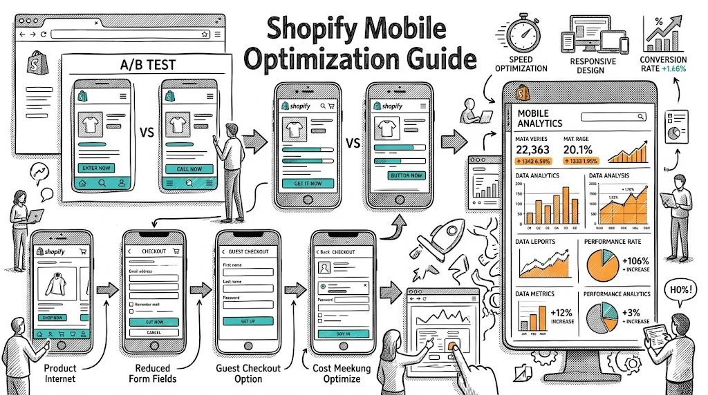
More than 70% of D2C traffic is mobile, and traditional comparison tables break on small screens โ€” too many columns, tiny text, horizontal scrolling. Mobile-optimized approaches:

  • Card-based comparison: Each product is a vertical card; swipe horizontally to compare
  • Attribute accordion: Expand individual attributes to see all products side-by-side
  • "Compare" toggle: Let buyers select 2โ€“3 products from a collection page and open a comparison modal

Test which mobile layout your audience prefers โ€” conversion impact varies significantly by category and audience.

Comparison Table Placement: Where to Put It

On the Product Detail Page (PDP)

Place the comparison table in one of three locations and A/B test:

Option A: Variant selector area โ€” directly below or adjacent to the variant picker (size, tier, bundle choice). This placement intercepts the decision at the moment of hesitation.

Option B: Mid-page โ€” after the hero content and main product description, before the reviews section. This works for considered purchases where buyers read through before deciding.

Option C: Above the fold โ€” for product families with very distinct variants (starter vs. pro, monthly vs. annual), a compact comparison table above the fold reduces drop-off at the first moment.

Test all three for your highest-traffic product.

On Collection and Category Pages

Collection-level comparison helps buyers narrow choices before arriving at a PDP. A filter-linked comparison widget ("Compare selected products") or a "How to choose" comparison module near the top of a collection page reduces the number of PDP bounces.

On Dedicated Comparison Landing Pages

If your product line has meaningful complexity (3+ product lines, each with 3+ variants), a standalone "Compare all products" page can capture buyers searching for "brand X vs. brand Y" or "product A vs. product B."

A/B Testing Strategies for Comparison Tables

Test 1: Table vs. No Table

Control: variant picker only (standard dropdown or button selector) Variant: variant picker + comparison table

Measure: add-to-cart rate, variant distribution (which option gets selected), and AOV. This is your baseline test โ€” it tells you whether a comparison table helps at all for this product.

Test 2: Recommended Option Labeling

Control: "Most Popular" label on mid-tier option Variant A: "Best Value" label Variant B: "Editor's Pick" Variant C: No label (table only, no recommendation)

Often, "Most Popular" outperforms "Best Value" because it's a social proof signal rather than a price signal. But this varies by category โ€” test it.

Test 3: Number of Rows

Control: 7-row comparison table Variant: 4-row table (only the most critical attributes)

Simpler tables sometimes outperform more complete ones โ€” the extra rows add complexity without adding decision clarity. Find the minimum viable comparison.

Test 4: Mobile Table Format

Control: standard horizontal scroll table Variant A: card-based swipe comparison Variant B: accordion attribute comparison

Mobile UX has a massive impact on conversion for table elements. The winning format typically depends on how many columns you're comparing.

Test 5: Highlighted Column Position

Control: recommended option in the center column Variant: recommended option in the right column (most expensive)

Center placement feels neutral; right placement can nudge toward the highest-tier option. The impact varies โ€” test for your catalog.

Real D2C Examples

Supplement brand with 3 protein tub sizes (1kg / 2kg / 4kg): Adding a comparison table showing price-per-serving, total servings, and a "Best value" label on the 2kg option shifted 35% of 1kg buyers to the 2kg, lifting AOV by โ‚น400 per order.

Skincare brand with 3 regime kits (basic / complete / luxury): A comparison table showing which concerns each kit addresses, with "Most popular" on the complete kit, improved AOV by โ‚น600 and reduced "which kit is right for me?" support tickets by 40%.

SaaS pricing page (applicable to subscription D2C): A 5-row comparison table (features, users, support, storage, price) with "Recommended" highlighted on the middle tier consistently outperforms a bulleted list of features and lifts mid-tier plan selection.

Tips and Best Practices

  • Use real data for social proof in the table โ€” "4,200+ buyers chose this" in the recommended column outperforms a generic label
  • Make the table scannable, not exhaustive โ€” if you need 12 rows to cover everything, your product lines may need simplification, not a bigger table
  • Keep currency and pricing prominent โ€” price per serving, price per day, or price per unit makes value comparison concrete and reduces price objection
  • Add a "Talk to us" option โ€” for complex product decisions, a "Not sure? Chat with our team" link below the comparison table converts undecided buyers into consultations
  • A/B test table vs. quiz โ€” for some categories, a "Find your perfect match" quiz outperforms a comparison table; test both
  • Track bounce rate on comparison table views โ€” if buyers are viewing the table and then bouncing, the table is creating confusion rather than clarity

Key Takeaways

  1. Comparison tables reduce decision fatigue and reliably improve AOV by guiding buyers toward mid-to-high-tier options
  2. Highlight one option as "Most Popular" or "Best Value" โ€” the recommendation anchor reduces paralysis and directs buying behavior
  3. Limit rows to 5โ€“7 most-critical attributes; more creates overwhelm rather than clarity
  4. Mobile-first layout (card swipe or accordion) dramatically outperforms horizontal scroll tables on mobile traffic
  5. A/B test: table vs. no table, label copy, recommended column position, and mobile format separately to identify what drives your specific lift
  6. Use outcome-oriented row labels ("Maximum recovery," "Best for beginners") rather than feature-only labels ("25g protein," "2,000 calories")

Related reading: Product Page Optimization Pillar | A/B Testing Pillar | Product Badges and Labels That Boost Sales | A/B Testing | Average Order Value